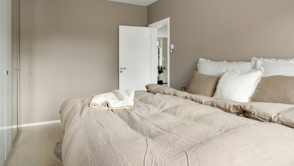
Natural light has the remarkable ability to enhance the ambiance of any space, making rooms feel more open, vibrant, and welcoming. However, certain design decisions, particularly regarding wall paint, can unintentionally diminish this effect. For example, dark or overly saturated colors can absorb light, making a room appear smaller and more confined. Additionally, selecting shades that clash with natural light can alter how it enters the room, reducing its brightness. By understanding the impact of wall colors on lighting and making mindful choices, you can ensure your space benefits from the full potential of natural light, creating a brighter, more inviting atmosphere.
1. Choosing Paint With a Matte Finish in Low-Light Rooms
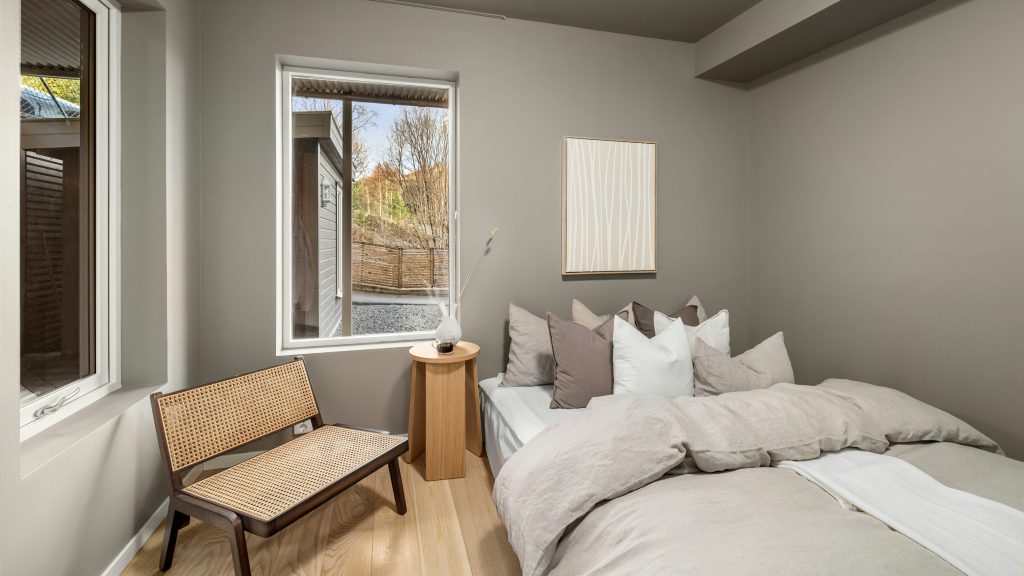
Matte finishes are often chosen for their ability to hide wall imperfections, providing a smooth, uniform look. However, they tend to absorb more light than they reflect, which can make a room appear flat and lackluster, especially in spaces with limited natural light. In contrast, semi-gloss and satin finishes have reflective qualities that help bounce light around a room, improving its brightness and visual depth. These finishes can maximize the effect of even minimal natural light, making a room feel more spacious and lively without overwhelming the space with shine.
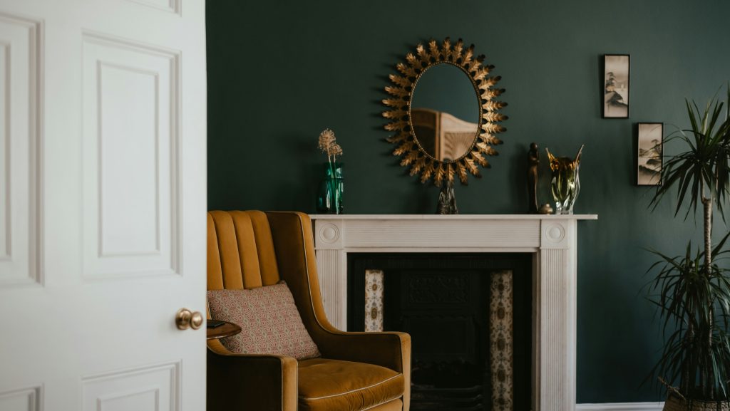
2. Going Too Dark Without Enough Contrast
Dark colors can evoke a sense of coziness, but without careful consideration of contrast, they can easily dominate a space, creating a heavy, cave-like atmosphere. To effectively incorporate dark hues like charcoal or navy, it is essential to balance them with lighter elements. One way to achieve this is by pairing dark walls with white baseboards, light trim, or pale wood accents. These contrasting features help maintain the richness of the dark tones while preventing the room from feeling too enclosed or dim.
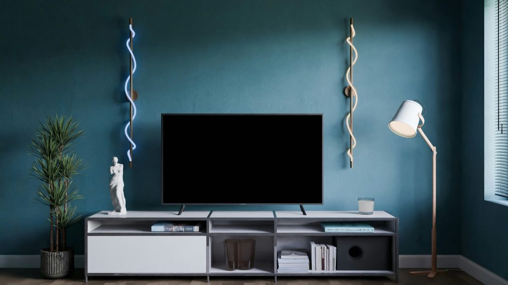
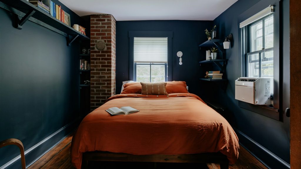
3. Painting All Four Walls in Saturated Hues
Using strong colors on all walls can diminish the effect of natural light, particularly in smaller rooms. This technique creates a heavy visual impact that can hinder light from reflecting throughout the space, making the room feel more enclosed. To maintain an open and airy atmosphere, it’s advisable to apply bold colors to just one accent wall or below a chair rail, while leaving the remaining walls in lighter tones. This approach ensures that the room remains bright and inviting, allowing natural light to bounce freely, while still introducing striking color to enhance the overall aesthetic.
4. Ignoring Undertones That Clash With Natural Light
When choosing paint colors for a room, it’s essential to consider how the undertones of the paint will interact with the natural light in the space. Colors with green or gray undertones, for example, can appear dull or washed out depending on the direction and intensity of the light. North-facing light, which is often cooler, can cause certain hues to look less vibrant. To ensure the color complements your room’s lighting, it’s important to test paint swatches at different times of day.
5. Forgetting to Paint the Ceiling a Lighter Shade
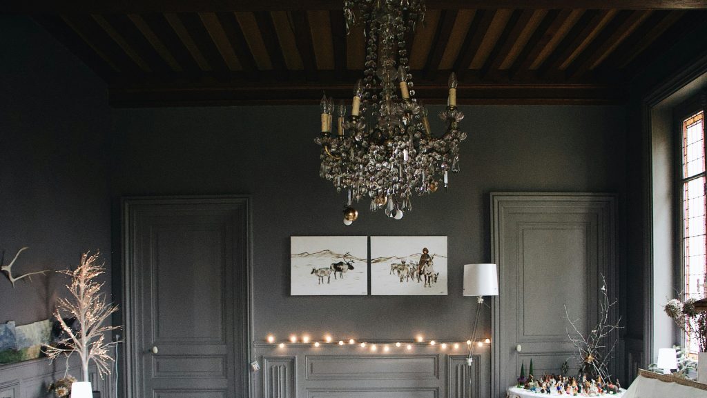
The ceiling is often referred to as the “fifth wall” in interior design due to its significant influence on a room’s overall ambiance. Its color can affect both the perception of light and the spatial feel of the area. Painting the ceiling in the same dark hue as the walls can make a room feel closed off and heavier. To counteract this effect and promote a brighter, more expansive atmosphere, it is recommended to use a lighter, softer shade of the wall color, or even opt for classic white.
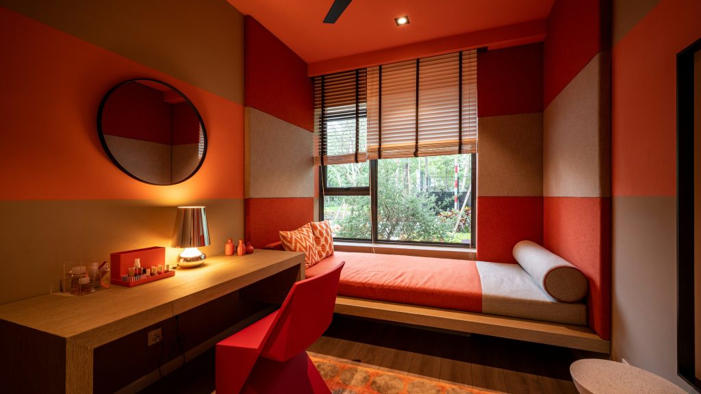
6. Using High-Chroma Colors Without Diffused Light
High-chroma colors, such as vibrant reds or citrus greens, are known for their intense saturation, but they can cause issues when exposed to direct sunlight. These colors tend to reflect light unevenly, leading to glare or visual discomfort, which can make a space feel harsh and disjointed. The intense light reflection can disrupt the overall atmosphere, making the room feel less inviting. To achieve a more balanced and soothing environment, it’s advisable to choose more muted or pastel versions of these colors.
7. Skipping Primer, Especially Over Old Colors
When repainting a surface, skipping the primer can lead to several issues, including uneven color coverage and a compromised finish. Without a primer, the underlying layer may alter the new paint’s appearance, resulting in a muddied or dull tone. Primer plays a crucial role in preparing the surface, ensuring that the paint adheres properly and displays its true color. It creates a smooth, even base that enhances the vibrancy of the paint, improving both the aesthetic and functionality of the room.
8. Not Coordinating With Window Direction and Room Function
The quality of light in a room is significantly influenced by its orientation, impacting the overall ambiance and how colors are perceived. South-facing rooms typically receive warm, golden light, which can enhance the richness of hues and create a cozy, inviting atmosphere. In contrast, north-facing rooms are bathed in cooler, bluish light, often leading to a more subdued, tranquil feel. When selecting paint colors, it is essential to consider the direction of light, as failing to do so can result in a mismatch that may make a room feel darker or colder than intended.
This article was created with the assistance of AI but thoroughly edited by a human being.