Natural light is one of the most valuable elements in any space, it lifts the mood, makes rooms feel bigger, and brings out the true beauty of your home. But the colors you choose play a huge role in how that light works for you. Some shades can soak it up, leaving rooms feeling flat or gloomy, while others bounce it around, making everything feel fresh and open. Whether you’re just updating a room or doing a full-on makeover, picking the right palette can completely transform your space into a warm, radiant retreat you’ll love coming home to.
1. Charcoal Gray
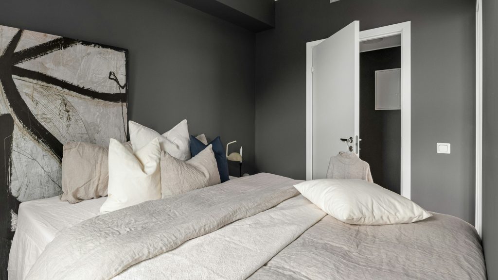
Charcoal gray offers a sleek, modern, and moody aesthetic that adds depth and sophistication to a room. However, it tends to absorb a lot of light, which can make spaces with limited natural light feel smaller, darker, and a bit cold. In rooms without many windows, it can create a heavy or somber atmosphere. To balance it out, pair charcoal gray with lighter furnishings, warm textures, mirrors, or metallic accents. It really shines in bright spaces where sunlight can soften its intensity and bring out its richness.
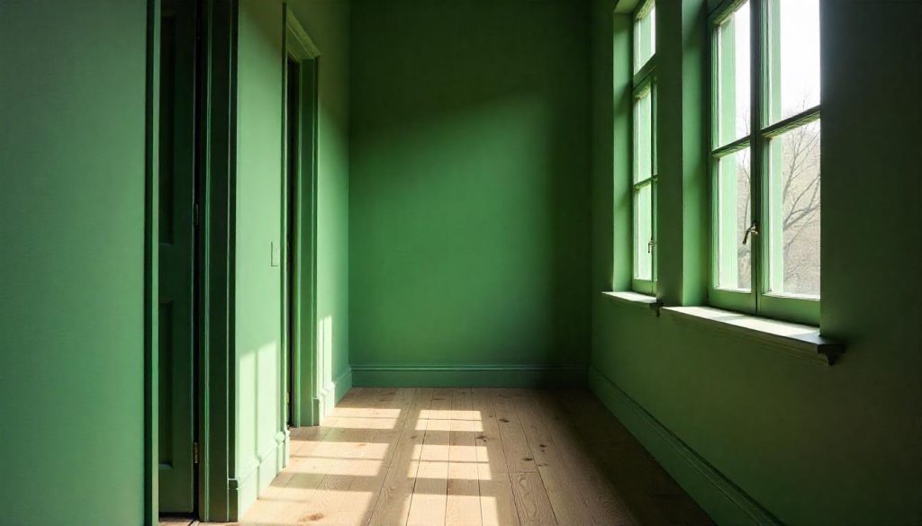
2. Hunter Green
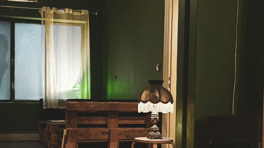
Deep greens like hunter green bring a rich, dramatic vibe to a space, making it feel cozy and grounded. But in small or north-facing rooms, this shade can soak up natural light and make the room feel darker or even a bit claustrophobic. To avoid that cave-like feel, pair it with crisp white trims, light-colored furniture, or plenty of mirrors to bounce light around. It works best as an accent wall or in well-lit areas where its depth can shine without overwhelming the room. Balance is key with bold colors like this.
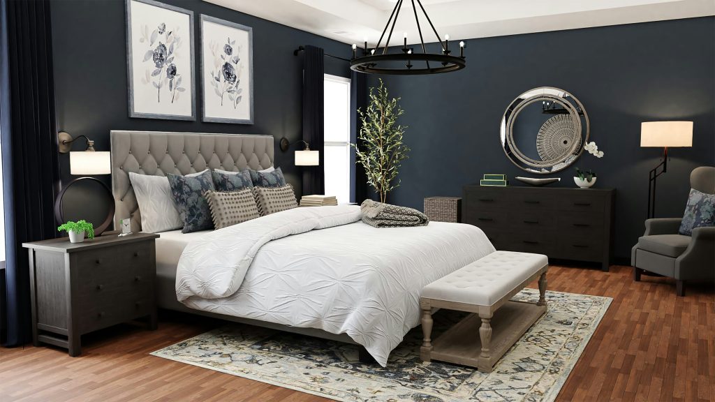
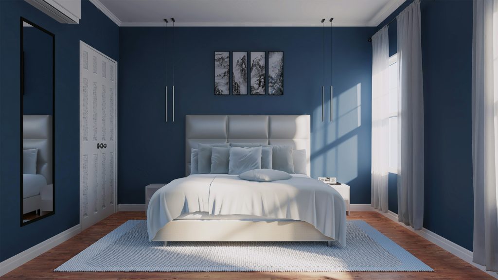
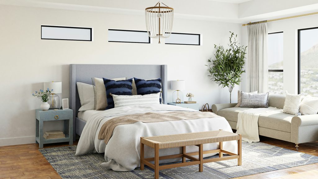
3. Navy Blue
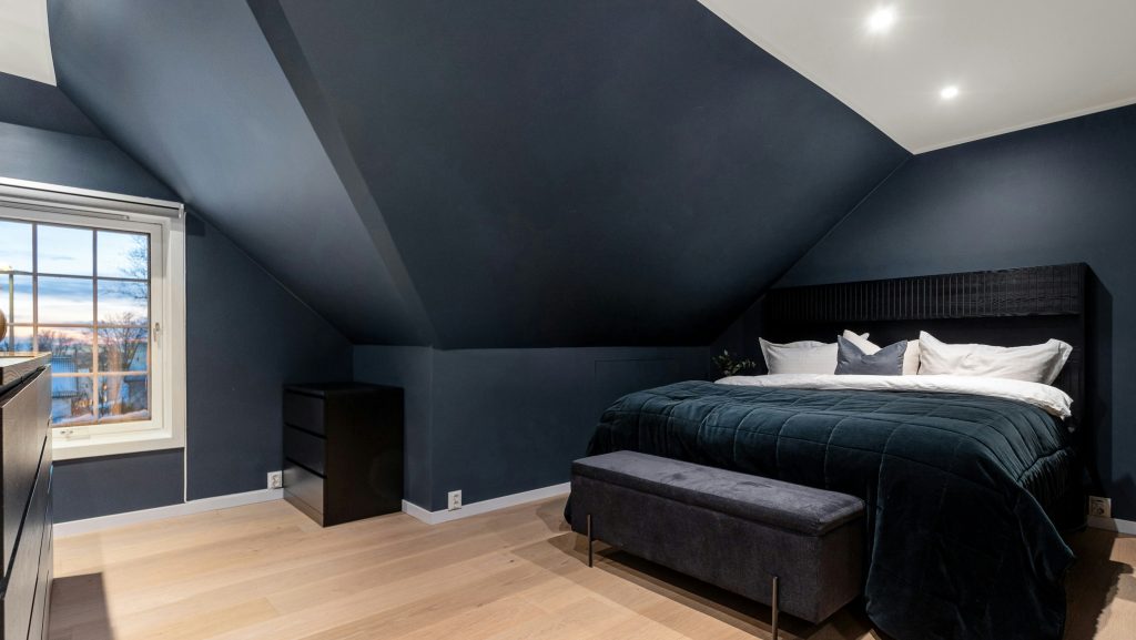
Rich navy exudes a sense of depth and sophistication, often making a space feel grounded and intimate. It’s a bold choice that wraps a room in a cocoon-like warmth, perfect for cozy spaces like bedrooms or dens. However, in larger areas or those lacking natural light, it can easily tip into feeling heavy or enclosed. To balance it out, consider incorporating mirrors, metallic accents, or lighter furnishings to reflect light and add contrast. Thoughtful layering with textures, warm lighting, and complementary tones can make navy feel dramatic yet inviting, rather than overly dark or overwhelming.
4. Terracotta
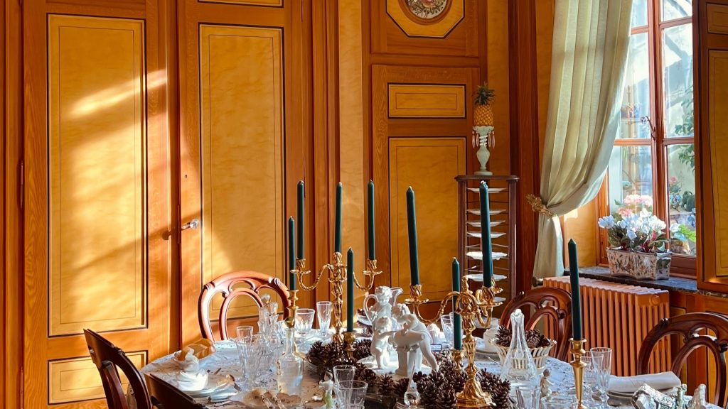
Terracotta’s earthy charm brings warmth and groundedness to a space, like a cozy desert sunset baked into your walls. But it’s a tricky one, it often casts a dull orange hue that can mute natural light and make rooms feel heavy or dim. In the wrong setting, it leans muddy and dated, especially under cool lighting. To really let it shine, pair it with plenty of natural sunlight, think south-facing rooms or spaces that glow during golden hour. Add textures like linen or rattan, and terracotta becomes soulful, not stale. It’s all about balance and intention.
5. Chocolate Brown
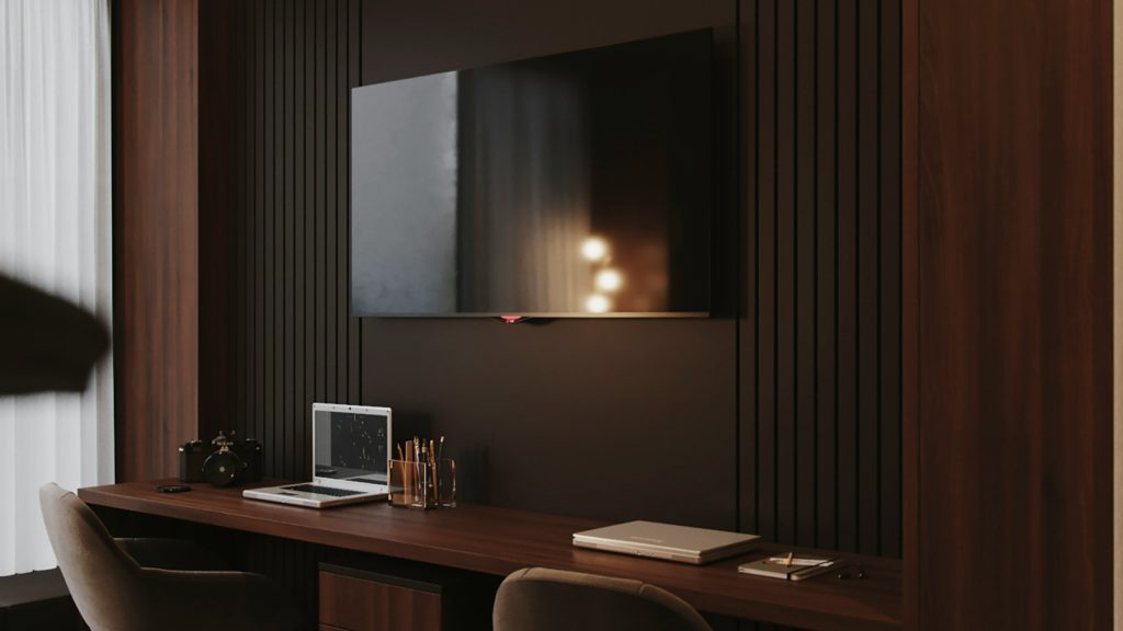
Chocolate brown is rich, grounded, and full of warmth, it brings an earthy elegance to a space. But it’s also a color that absorbs light rather than reflects it, which can make smaller rooms feel more closed-in or dim, especially if there’s not much natural sunlight. In spaces that don’t get much daylight, it can feel a bit heavy or somber. That said, it’s perfect in moderation on furniture, trim, or accent walls, where it adds depth and contrast without overwhelming the space. Used thoughtfully, it can be incredibly cozy and sophisticated.
6. Olive Green
Although trendy, olive green has a muted undertone that can sap energy from a space. It’s a sophisticated and earthy choice, but under low lighting conditions, it often appears muddy or flat. Without enough natural light or contrasting colors to liven it up, the room can feel a bit lifeless or heavy. To make it work, it really needs some crisp whites, warm wood tones, or metallic accents to balance it out. Otherwise, it risks blending into the background instead of bringing the calm, grounded vibe it’s known for.
7. Dusty Mauve
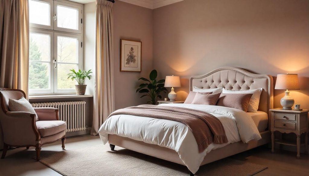
Dusty mauve can feel romantic and soft, bringing a quiet elegance to a space. Its muted, vintage tone creates a calming atmosphere that’s easy on the eyes. However, it often lacks the crispness needed to reflect light well, especially in rooms with low natural light. In dim settings, it can lean gray or even slightly muddy, which may make a space feel dull or lifeless. To make it work, pair it with warm metallics like brass or rose gold for contrast and warmth. And don’t underestimate the power of good lighting, it really helps this shade come alive.
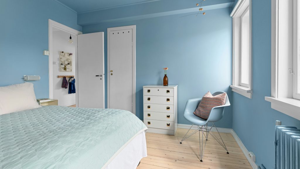
8. Slate Blue
Slate blue carries cool gray undertones that absorb more light than they reflect, creating a moody, introspective feel. While it looks stunning in design boards or small swatches, in real spaces it can cast lingering shadows and make rooms feel dimmer than expected. Without enough natural light, it can come off heavy or cold. That said, with the right lighting and complementary decor like warm woods or soft gold accents, it transforms into a rich, calming backdrop that feels sophisticated and serene. It’s all about balance.
While some colors can darken and mute a room’s natural beauty, others have the power to completely transform a space with light and energy. The right paint shade doesn’t just sit on your walls, it reflects light, enhances mood, and creates an inviting atmosphere. If your goal is to brighten your home and make it feel more open, airy, and welcoming, these five radiant paint colors are your go-to palette. Each one is designed to maximize natural light and bring a soft, luminous glow to any room.
1. White (with Warm Undertones)
A soft white with warm undertones is a timeless choice that brings a sense of calm and comfort to any space. It reflects natural light beautifully, making rooms feel airy, open, and inviting. Unlike harsh, cold whites, this shade adds a subtle glow that feels cozy yet fresh. It flatters both daylight and lamplight, making it versatile throughout the day. Whether you’re styling a sleek modern loft or a cozy, classic home, warm white creates a serene backdrop that lets your personality and decor shine.
2. Pale Butter Yellow
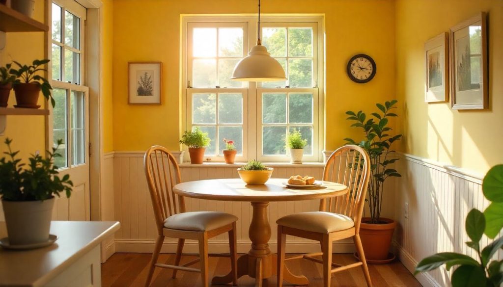
Pale butter yellow is a soft, inviting color that brings a refreshing and joyful vibe to any space. Its warm, golden undertones reflect natural light beautifully, making it perfect for brightening up rooms that may lack sunlight. Whether you’re in the kitchen, bathroom, or living room, this gentle hue creates a cheerful atmosphere that feels both cozy and uplifting. It’s an ideal choice for those looking to add warmth without being overwhelming. On dreary, overcast days, pale butter yellow can infuse the space with a touch of sunshine, creating a positive, energy-boosting environment all year round.
3. Sky Blue
Light, airy, and timeless, sky blue brings a sense of serenity and calm that mimics the vast, open sky. It adds an uplifting, refreshing touch to any room, evoking the feeling of being outdoors on a clear day. In spaces like bedrooms and bathrooms, sky blue enhances brightness, creating a peaceful, soothing atmosphere that encourages relaxation. The color has a magical way of making ceilings feel higher and rooms seem more expansive, giving even smaller spaces a sense of openness. Whether it’s used as an accent or a dominant hue, sky blue creates a tranquil, inviting environment that never goes out of style.
4. Cream
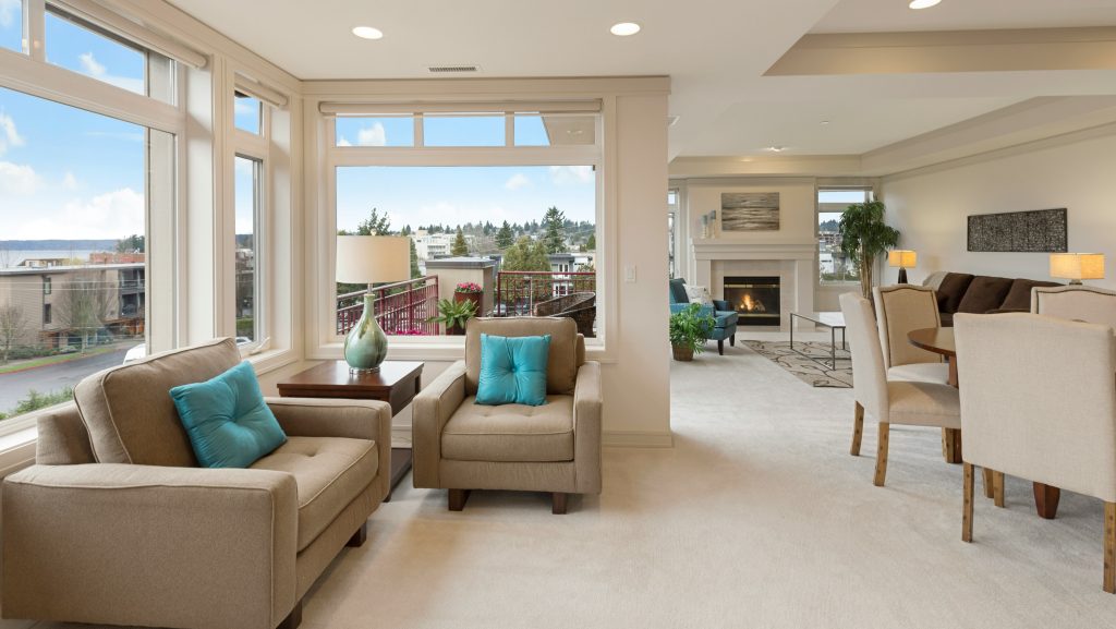
Cream is a soft, neutral shade that radiates warmth and sophistication while maintaining a sense of versatility. Unlike beige or tan, cream reflects more light, making spaces feel open and airy. Its subtle elegance creates a cozy, inviting atmosphere without being overwhelming. Perfect for open-concept living areas, cream serves as a beautiful backdrop for both traditional and modern minimalist design styles. It seamlessly complements a variety of furniture and décor choices, effortlessly blending with different color schemes. Whether used in a living room or bedroom.
5. Peachy Beige
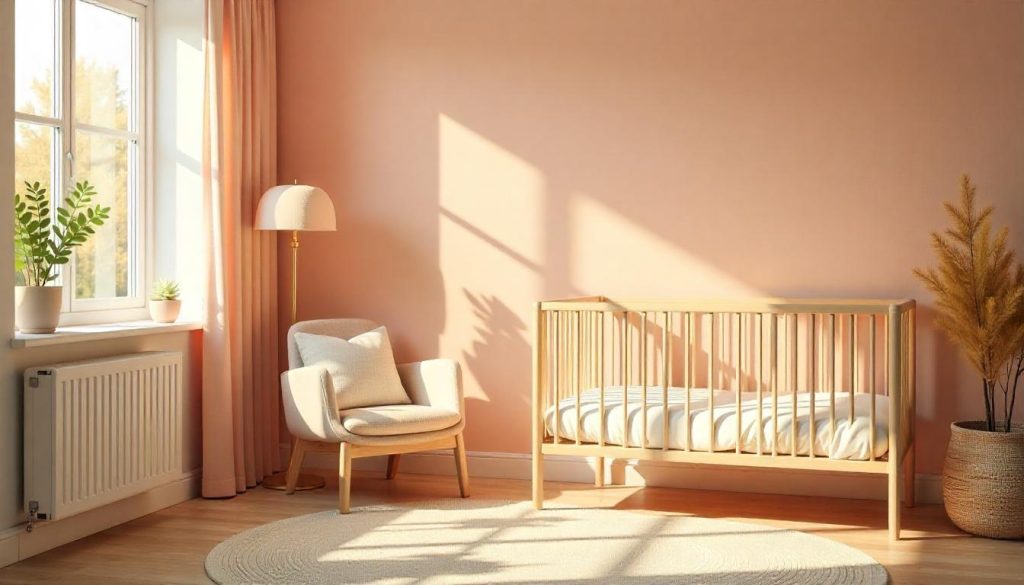
Peachy beige is a beautifully soft blend that brings together the brightness of a neutral with the gentle charm of a warm, subtle hue. Its delicate tone adds a welcoming glow to any space, especially in the soft, golden light of the afternoon. This versatile shade enhances warmth while remaining understated, making it perfect for creating a calm, cozy atmosphere. Whether used in bedrooms, nurseries, or hallways, peachy beige offers just the right hint of color without being overpowering. It’s ideal for spaces where you want a tranquil, inviting feel.
This article was created with the assistance of AI but thoroughly edited by a human being.