
Displaying wall art properly can transform a space, enhancing its aesthetic and creating a cohesive design. However, many people make simple mistakes that detract from the overall effect. Whether it’s hanging pieces too high or too low, using the wrong hardware, or neglecting lighting, these errors can make even the most beautiful art look out of place. By understanding these common pitfalls and learning how to correct them, you can create a polished and visually appealing display. Here are eight frequent missteps and practical solutions to ensure your wall art shines.
1. Hanging Art Too High or Too Low
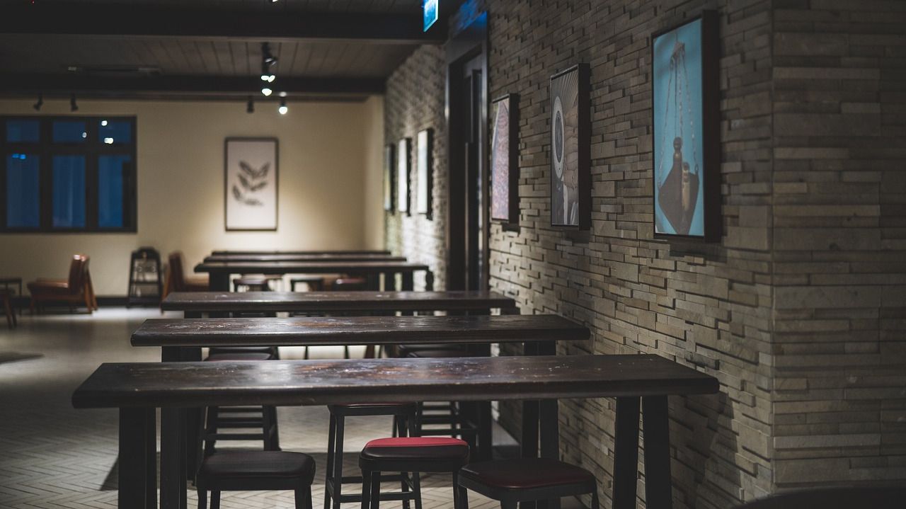
A common mistake is placing art too high or too low, making it uncomfortable to view. The ideal height for most pieces is eye level, with the center positioned around 150 cm from the floor. This ensures the artwork is easily visible and complements the room’s proportions. If you’re creating a gallery wall, maintain a consistent baseline to keep everything visually balanced. For spaces with high ceilings, consider lowering the art slightly to maintain a human-scale connection. Test the placement by holding the piece against the wall and stepping back to assess its position before committing.
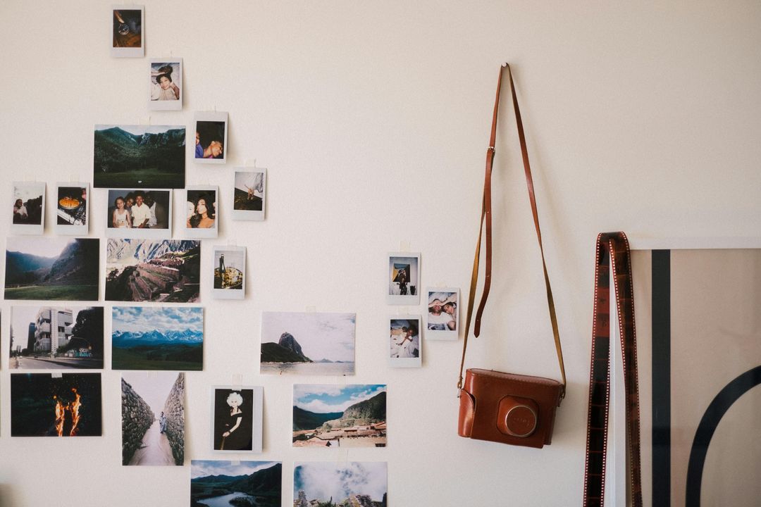
2. Poor Spacing Between Pieces
Improper spacing can make a wall feel cluttered or disconnected. Keeping a uniform distance—typically 5-10 cm between smaller frames and 10-15 cm between larger ones—helps maintain a clean and organized look. Use painter’s tape to plan layouts before committing to nails. For gallery walls, treat the entire arrangement as a single unit, ensuring even spacing between each piece. Avoid overcrowding, as it can overwhelm the viewer, and leave enough breathing room for each artwork to stand out. A well-spaced display creates harmony and allows each piece to shine.
3. Using the Wrong Hanging Hardware
Many people use small nails or weak hooks that fail to support their artwork properly. Heavy frames require wall anchors or two-point hanging systems to stay secure. Consider using picture-hanging strips for lightweight pieces to avoid unnecessary wall damage. For larger or heavier art, invest in sturdy D-rings or wire systems to distribute weight evenly. Always check the weight capacity of your hardware and choose options that match your wall type (drywall, plaster, or brick). Proper hardware ensures your art stays safely in place and prevents accidents.
4. Ignoring Wall Proportions
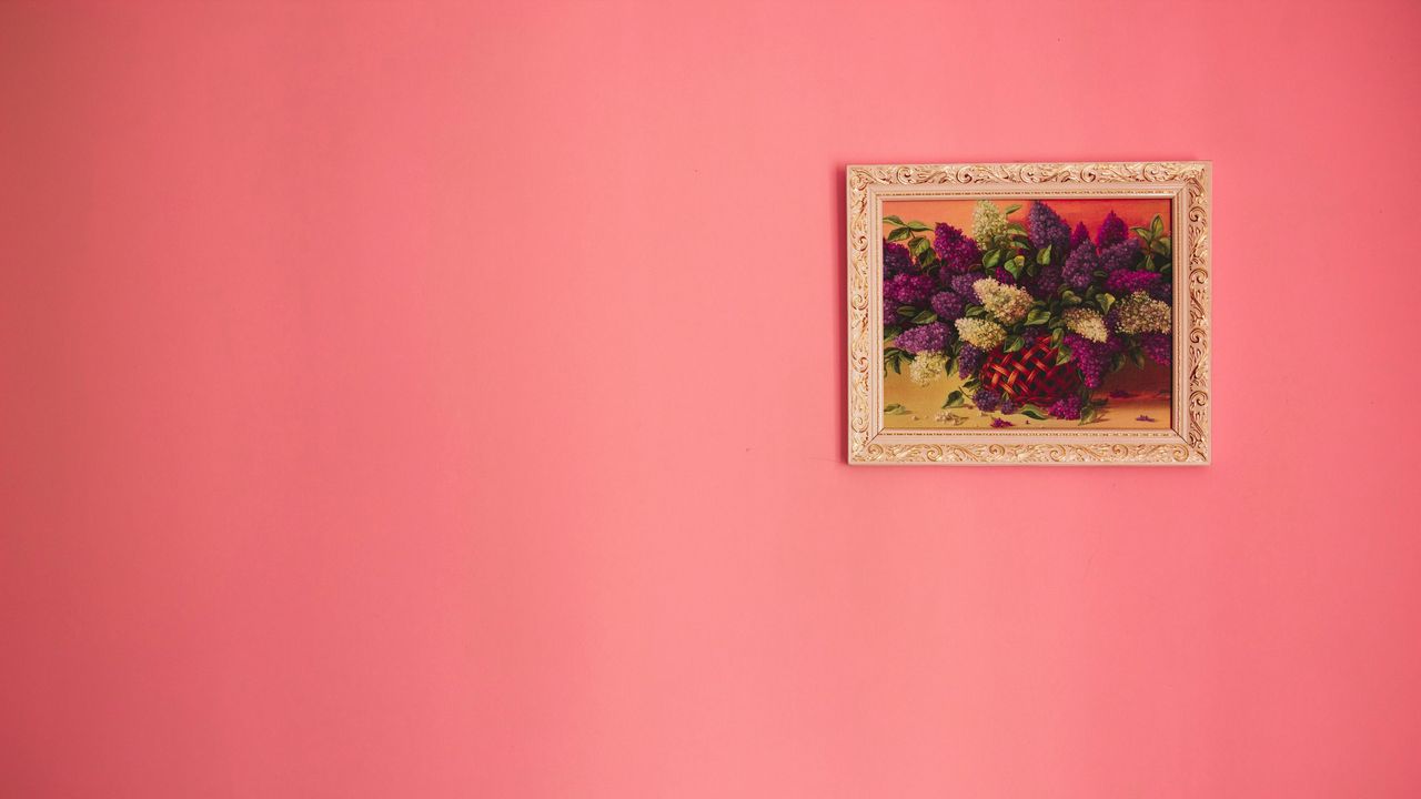
An artwork that is too small for a large wall or too large for a confined space can feel out of place. A good rule of thumb is to have the artwork take up about two-thirds of the available wall space. If one piece feels too small, consider pairing it with complementary pieces to create a larger composition. For oversized walls, a gallery arrangement or a single statement piece works best. Conversely, in tight spaces, opt for smaller, minimalist art to avoid overwhelming the area. Proportional balance is key to a harmonious display.
5. Neglecting Lighting Considerations
Lighting plays a significant role in how art is perceived. Poorly lit artwork loses its impact, while direct sunlight can cause fading. Position art where it can benefit from natural light without direct exposure, and consider installing adjustable wall sconces or track lighting to enhance its visual appeal. Use LED lights with a high CRI (Color Rendering Index) to accurately showcase colors. Avoid harsh overhead lighting, which can create glare. Proper illumination highlights textures, details, and colors, making your art a focal point.
6. Choosing the Wrong Wall Color

Wall color can either complement or clash with your artwork. Busy wallpaper or bold colors may distract from the piece itself. Neutral tones allow artwork to stand out, while strategic color coordination can enhance the overall presentation. For vibrant art, opt for muted backgrounds; for monochrome pieces, consider subtle contrasts. Test paint samples near your art to see how they interact. The right backdrop elevates the artwork, creating a cohesive and intentional look.
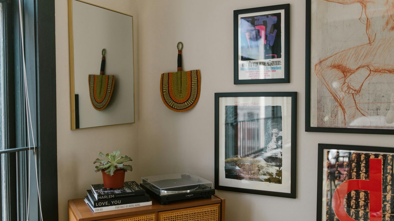
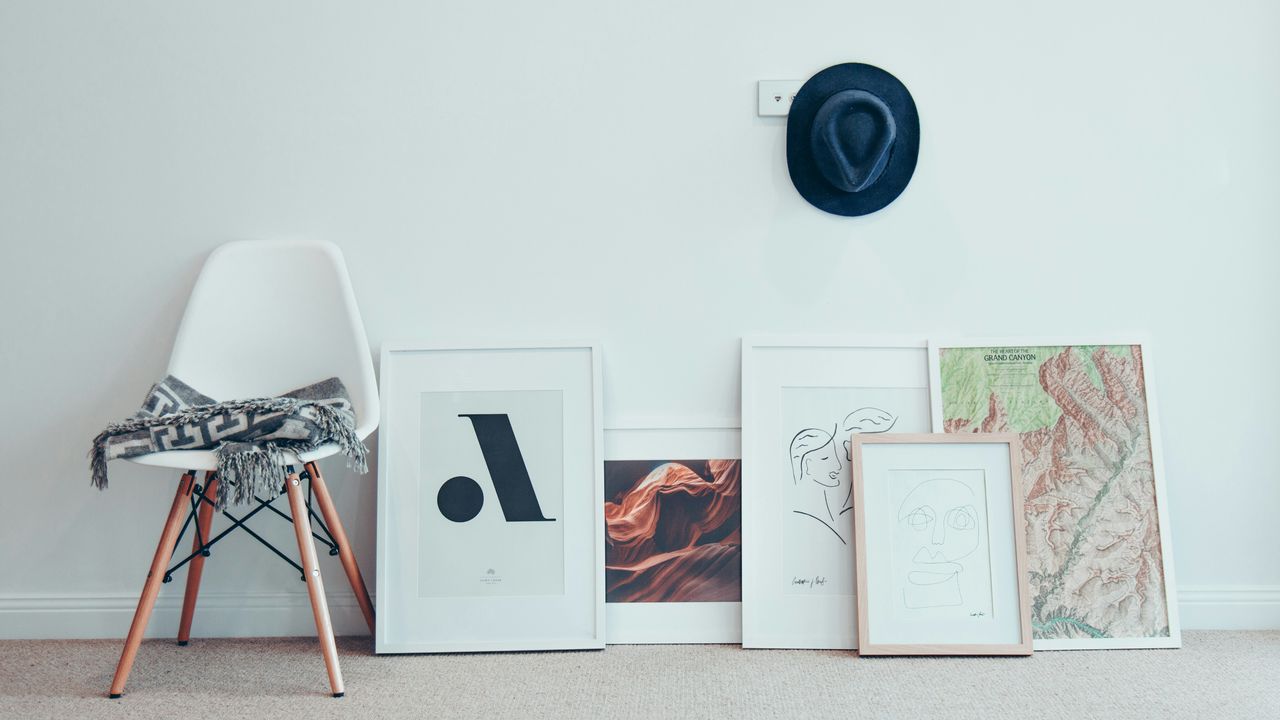
7. Failing to Create a Cohesive Arrangement
Randomly placing artworks without a clear plan can make the wall look disorganized. When curating a gallery wall, lay pieces out on the floor first to test arrangements. Aim for a balanced mix of sizes and orientations to create visual harmony. Use a consistent theme, color palette, or frame style to tie the display together. Symmetrical layouts feel formal, while asymmetrical ones add dynamism. Planning ensures a polished result that feels intentional and visually pleasing.
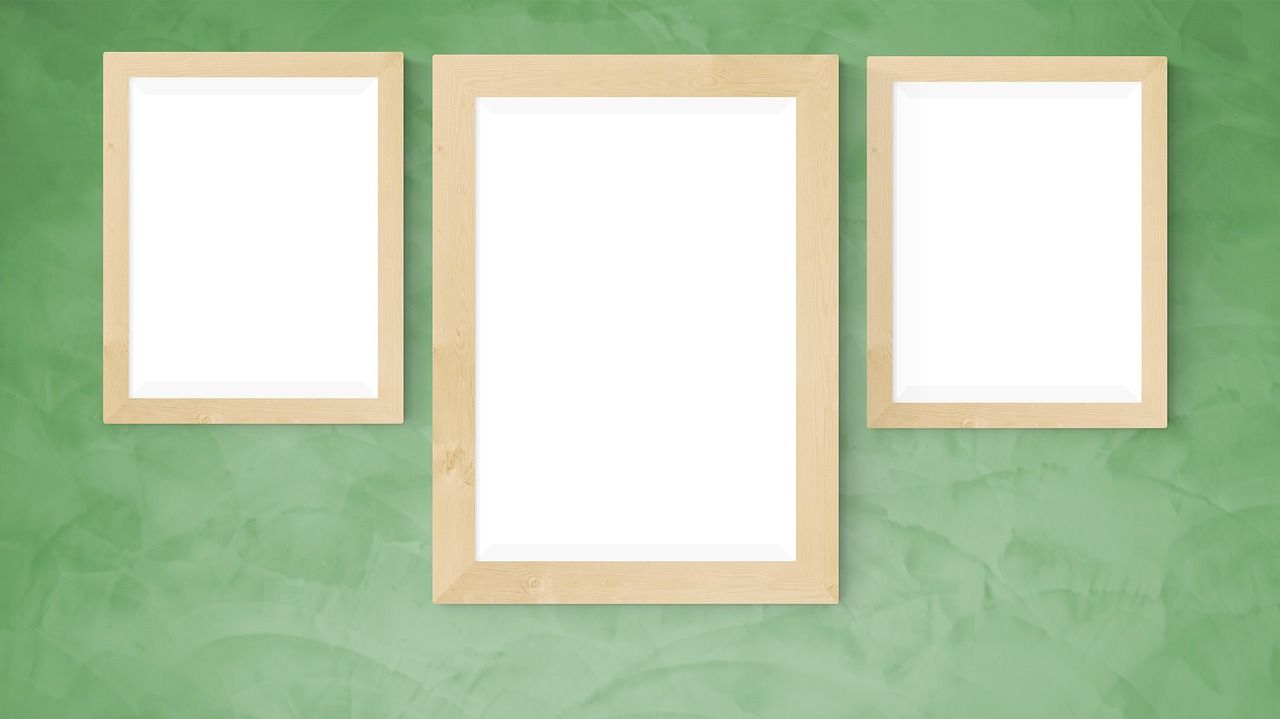
8. Overlooking Frame and Matting Choices
Frames and matting play a crucial role in how artwork is perceived. A mismatched frame can diminish the impact of a piece, while poor matting can make it look unfinished. Choose frames that complement both the artwork and the surrounding decor, ensuring they enhance rather than overpower the piece. For a modern look, opt for slim, minimalist frames; for traditional art, ornate frames add elegance. Matting should provide enough space to highlight the art without crowding it. Thoughtful framing elevates the entire presentation.
This article was created with the assistance of AI but thoroughly edited by a human being.