When decorating a room that faces north, you’ll quickly realize the challenge of dealing with the cooler, often dimmer light that enters these spaces. Northern light is often described as stark or neutral, which can make certain colors appear too cold, uninviting, or flat. The key to creating a balanced and welcoming atmosphere in a north-facing room lies in choosing colors that complement rather than clash with the light. To guide you through this, designers recommend steering clear of certain shades that can exacerbate the chilly nature of the room, leaving it feeling darker and less cozy. Here are 8 colors that should be avoided if you want to enhance the vibe of your space and avoid a dreary, unbalanced look.
1. Too Much Gray
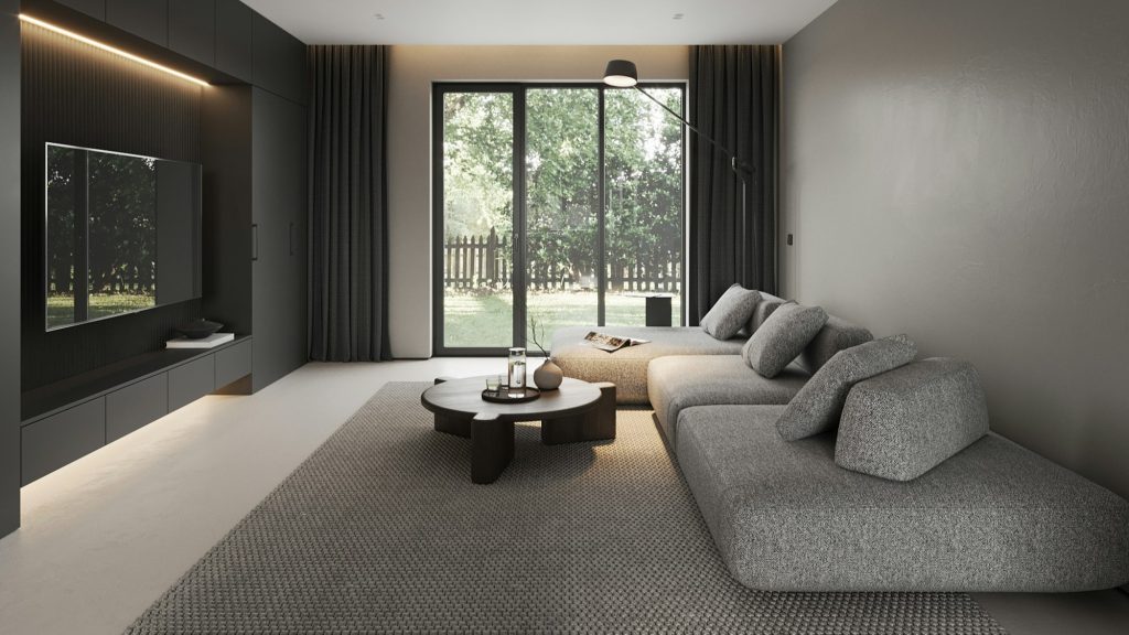
Gray is undeniably a popular neutral, offering sophistication and a modern touch to any room. However, when overused in north-facing spaces, it can give off a moody, uninviting vibe. The natural cool light in these rooms only accentuates gray’s tendency to feel dull and lifeless. While gray is versatile, it often lacks the warmth that can make a room feel inviting. To avoid a cold, cave-like atmosphere, consider opting for warmer gray tones or pairing it with more vibrant, energizing colors to balance the space and create a more welcoming environment.
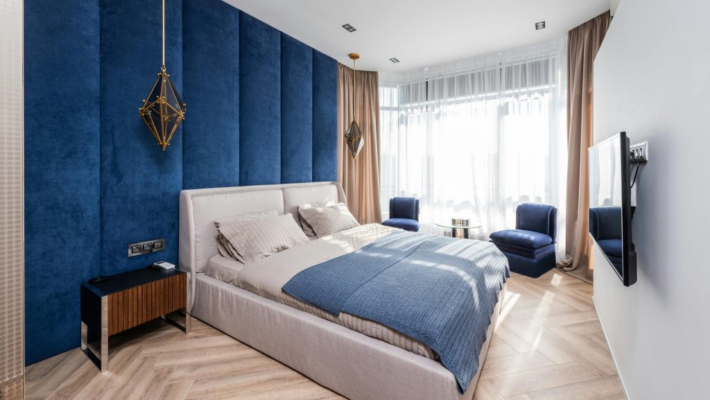
2. Cool Blues
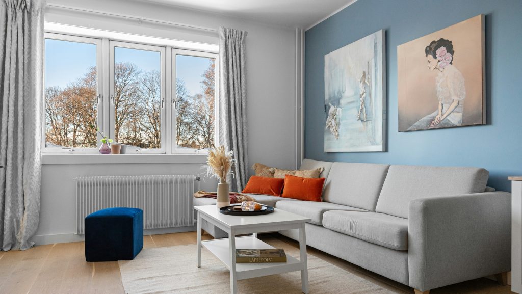
Cool blues can be striking in spaces bathed in warm sunlight, creating a calm and refreshing vibe. However, in north-facing rooms where sunlight tends to be cooler, these shades can feel too chilly and sterile. The natural light doesn’t complement the cool tones, making the space seem uninviting and distant. Instead of evoking a serene, peaceful atmosphere, a cool blue room can end up feeling emotionally flat. To balance this, consider using warmer blue shades like teal or turquoise, or mix in soft, earthy accents like wood tones or golds to add warmth and create a more inviting environment.
3. Bright White
While bright white walls might seem like a perfect solution to bring light into a north-facing room, they can sometimes have the opposite effect. In such spaces, bright whites often appear too harsh and stark, especially under the softer, cooler natural light. This can make the room feel colder and more sterile, rather than inviting. If you’re drawn to the clean, fresh look of white, consider opting for off-white, warm creams, or soft ivories. These tones offer a warmer, more welcoming vibe and help balance the cool light, creating a cozier and more comfortable atmosphere.
4. Dark Greens
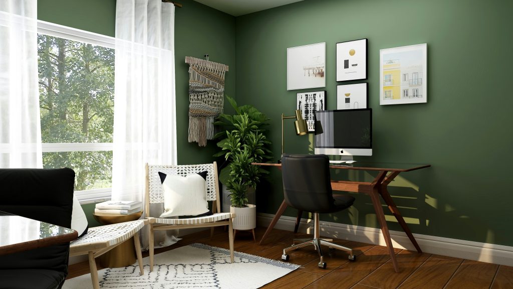
Dark, muted greens, while often linked with nature and a sense of tranquility, can feel quite heavy in a north-facing room. The cooler, dimmer light that such rooms receive tends to make these deeper tones appear even more subdued, creating a sense of gloominess and enclosure. Instead of feeling calm, the room might take on an oppressive atmosphere. To avoid this, consider opting for lighter shades of green, like sage or mint. These fresher, airier tones will help brighten the space, bringing in a lively, serene vibe that still connects with nature without overwhelming the room.
5. Black

Black is undeniably dramatic and bold, but in a north-facing room, it can quickly tip the balance from stylish to suffocating. The lack of natural light in these spaces can intensify the dark shadows and stark contrasts that black creates, making the room feel more like a dungeon than a cozy sanctuary. This can give the space a smaller, colder vibe that feels less inviting. To make black work in a north-facing room, consider using it as an accent color think black throw pillows, artwork, or a feature wall rather than drenching large surfaces. This approach adds sophistication without overwhelming the room’s natural calm.
6. Pale Pink
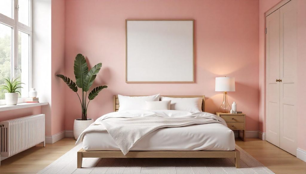
While pale pink is often associated with creating a soft, feminine vibe, it can struggle in a north-facing room. The cold, natural light tends to strip away its warmth, turning what should be a delicate blush into a flat, muted pink that feels lifeless and almost sickly. If you love pink but want to avoid that washed-out effect, opt for deeper shades like rose, coral, or even a dusty pink. These richer tones bring warmth and vibrancy to the space, creating a welcoming, cozy atmosphere even when the light outside is cool.
7. Lilac
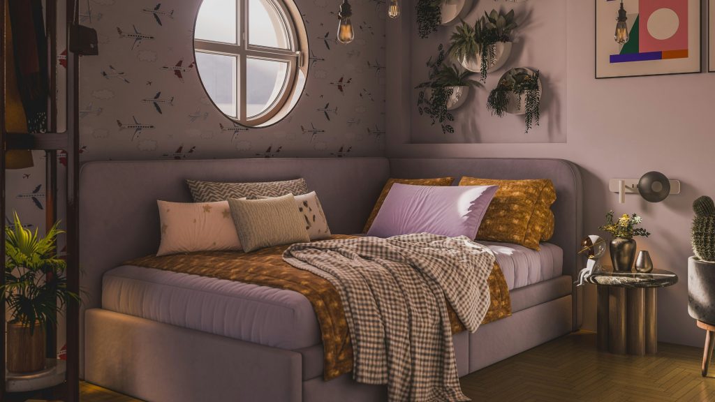
Lilac is such a soft, dreamy color, perfect for creating a serene atmosphere. However, in rooms with north-facing light, it can sometimes appear overly cool, almost faded. The light in these spaces tends to strip the color of its vibrancy, leaving lilac looking a bit flat or washed out. If you’re in love with purple tones but want something that feels more dynamic, consider warmer shades like lavender or mauve. These tones still offer that soothing, calming feel but add a bit more warmth and depth, bringing richness to the room without feeling cold or underwhelming.
8. Bright Yellow
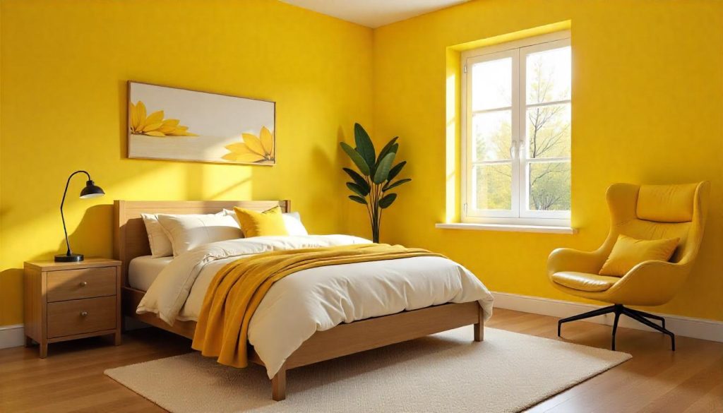
Bright yellow is often chosen for its ability to bring cheerfulness and energy to a room, but in a north-facing space, it can sometimes feel too sharp and harsh. The cool, indirect light that pours in from the north can strip yellow of its natural warmth, turning it from sunny to an uncomfortably glaring hue. If you’re drawn to yellow but want to avoid that intensity, consider opting for softer shades like buttery yellow or mustard. These tones add a cozy, inviting warmth to the room, creating a balanced atmosphere that still feels vibrant without overwhelming the space.
This article was created with the assistance of AI but thoroughly edited by a human being.