Your bedroom’s paint choice plays a bigger role in sleep quality than you might think. The wrong shades can feel overwhelming, too dull, or visually disruptive, making it harder to unwind. Even the finish and undertones can affect how restful the space feels. A well-chosen color palette, paired with the right lighting and decor, creates a soothing atmosphere that encourages relaxation, helping you fall asleep faster and wake up feeling refreshed.
1. Bright Red – Overly Stimulating and Energetic
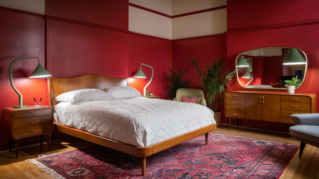
Red is a bold and passionate color, but in a bedroom, it can be overly stimulating. Studies suggest that red increases heart rate and energy levels, making it difficult to unwind before bed. Instead of promoting rest, it can create a sense of urgency or agitation. While it works well as an accent, using bright red as a dominant wall color may lead to restless nights and difficulty falling asleep, disrupting your overall sleep quality.
2. Dark Gray – Too Gloomy and Depressing

While gray is often associated with modern sophistication, dark gray tones can feel heavy and somber, making a bedroom feel unwelcoming. This color absorbs light, reducing warmth and making the space appear smaller and closed off. Instead of creating a cozy retreat, it can contribute to feelings of sluggishness or even sadness, which may affect your mood and make it harder to wake up refreshed. Lighter, warmer neutrals are a better choice for relaxation.
3. Neon Yellow – Overwhelming and Distracting
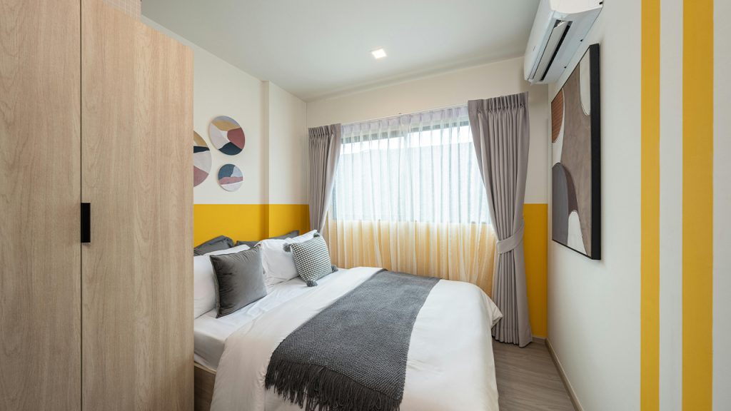
Yellow is often linked to happiness and energy, but in neon or overly bright shades, it can be overstimulating. Instead of creating a calming atmosphere, it bombards the senses, making it difficult to relax. Neon yellow reflects a lot of light, which can strain the eyes, especially at night. Softer, muted yellows or warm creams can still bring warmth to a space without causing restlessness or interfering with a restful night’s sleep.
4. Cool White – Harsh and Sterile Ambiance
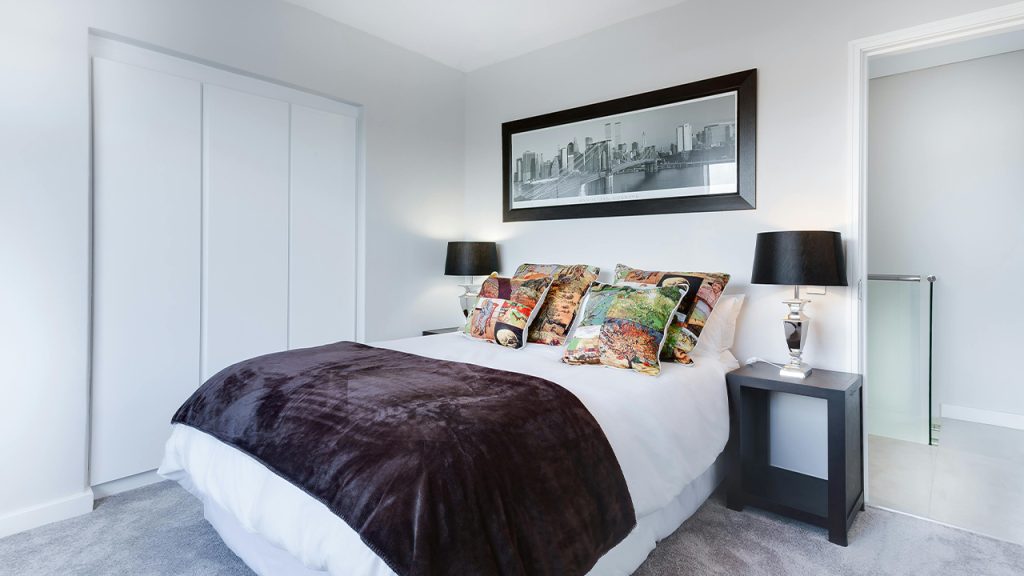
Crisp, cool whites can make a bedroom feel stark and clinical rather than cozy and inviting. While white is often associated with cleanliness, overly cool shades lack warmth and may create an unwelcoming atmosphere. The bright, reflective nature of stark white walls can also interfere with relaxation, making it harder to wind down. Warmer off-white or beige tones provide a similar airy feel while promoting a sense of comfort and tranquility.
5. Deep Purple – Too Intense for Relaxation
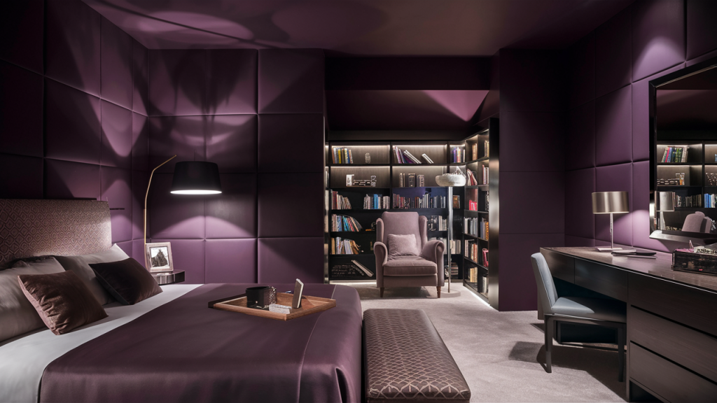
Purple is often associated with luxury and creativity, but deep shades like eggplant or plum can be too intense for a restful bedroom. The richness of dark purple can overstimulate the mind rather than encouraging relaxation, making it harder to unwind. Additionally, it absorbs light, which can make the space feel enclosed or moody rather than cozy. Softer lavender or muted mauve tones are better options for a calming bedroom atmosphere.
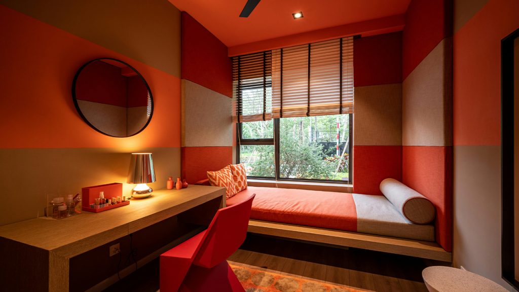
6. Bold Orange – Overexciting and Restless
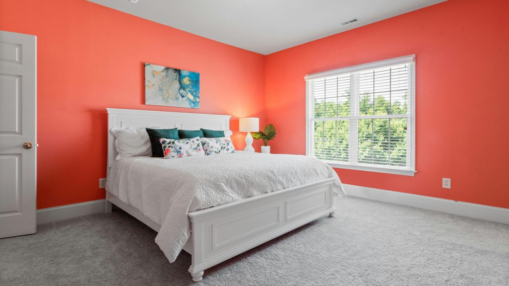
Orange is a lively and cheerful color, but in its boldest shades, it can be too energetic for a sleep-friendly space. It stimulates the senses and increases alertness, which is the opposite of what’s needed before bedtime. The warm undertones may also feel overwhelming in artificial lighting, making it difficult to create a peaceful ambiance. If you love orange, opt for softer peach or terracotta hues that provide warmth without overstimulation.
7. Jet Black – Heavy and Confining
While black can add drama and sophistication, using it excessively in a bedroom can make the space feel small and confining. Its ability to absorb light can create a heavy atmosphere, leading to a sense of isolation rather than comfort. Dark walls may also contribute to feelings of sluggishness in the morning, making it harder to wake up refreshed. Instead, deep charcoal or navy can offer a similar modern look with a softer, more relaxing feel.
8. Vibrant Blue – Too Cool and Unsettling at Night
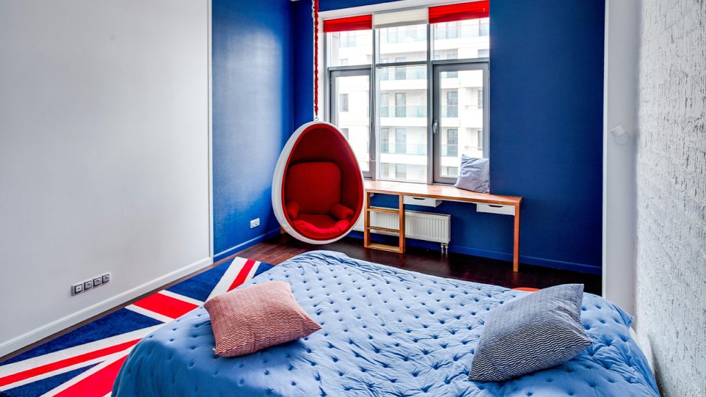
Blue is often recommended for bedrooms, but overly bright or electric blue shades can have a jarring effect. Vibrant blues can feel too energetic, preventing the body from fully winding down. Additionally, cooler blue tones may make the room feel colder, which isn’t ideal for creating a cozy retreat. To enjoy blue’s calming qualities without the drawbacks, opt for muted tones like dusty blue, slate, or soft sky blue.
This article was created with the assistance of AI but thoroughly edited by a human being.