While classic white and gray remain kitchen staples, many designers turn to underrated paint colors that add unexpected charm and sophistication. These shades create warmth, depth, and personality, helping kitchens feel more inviting and refined. Whether you’re drawn to earthy tones, rich hues, or subtle pastels, these overlooked colors can transform your space without overpowering it. If you’re looking to refresh your kitchen with a designer-approved look, consider these five underrated shades that bring a fresh, stylish appeal to any culinary space.
1. Soft Sage Green
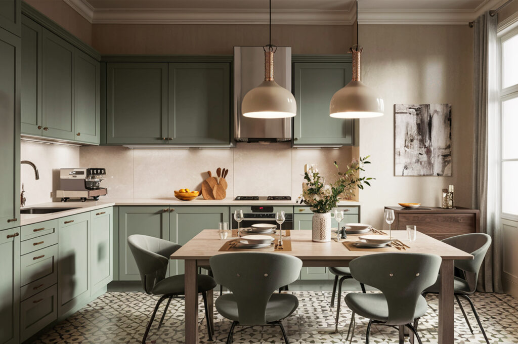
Soft sage green is a versatile, nature-inspired hue that brings a sense of calm and warmth to the kitchen. Unlike bolder greens, this muted tone pairs beautifully with a range of materials, from natural wood to sleek marble countertops. Its subtle earthy quality makes it a great alternative to white or gray, offering a hint of color without overwhelming the space. Designers love it for its timeless appeal and ability to complement both traditional and modern styles. Whether on cabinets or walls, sage green enhances natural light, making kitchens feel open and airy.
2. Muted Terracotta
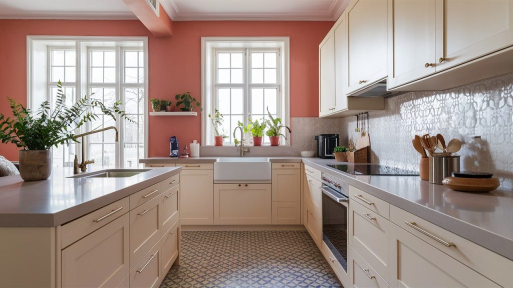
Muted terracotta may not be the first color that comes to mind for kitchens, but it delivers a cozy, lived-in feel that instantly elevates the space. This warm, earthy tone adds depth without being too bold, creating a rustic yet refined aesthetic. When paired with white cabinetry or neutral countertops, it provides a subtle contrast that feels sophisticated rather than overpowering. Designers appreciate its ability to make a kitchen feel welcoming while adding a touch of Mediterranean or Southwestern charm. It’s a perfect choice for those looking to embrace a more grounded, organic palette.
3. Stormy Blue
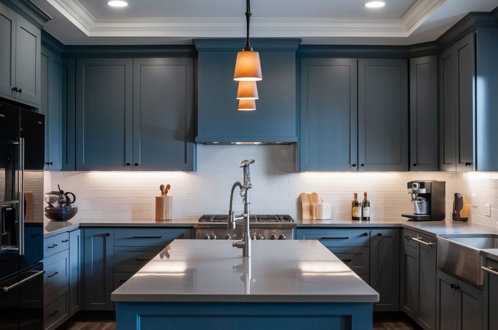
Stormy blue is a deep, moody shade that exudes elegance while remaining incredibly versatile. Unlike bright blues, this muted tone has a gray undertone that keeps it from feeling overwhelming, making it perfect for kitchen cabinetry or accent walls. It works beautifully with brass or matte black hardware, adding a touch of sophistication to the space. This shade pairs well with both warm and cool tones, allowing it to blend seamlessly with wood finishes, marble surfaces, and neutral walls. For a timeless, high-end feel, stormy blue is a designer favorite that never disappoints.
4. Warm Mushroom Beige
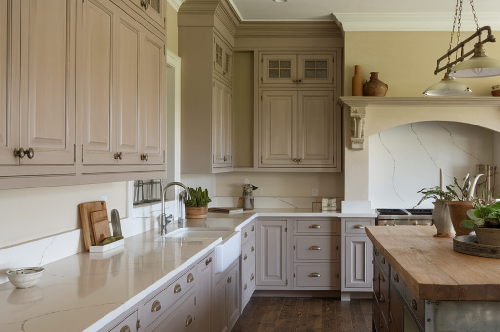
Warm mushroom beige is a refined neutral that strikes the perfect balance between gray and brown, offering warmth without appearing dull. Unlike standard beige, this shade has depth, and a subtle grey undertone making it a great backdrop for both modern and classic kitchen styles. It pairs well with natural textures like wood and stone, creating a welcoming, organic feel. Designers love its adaptability, as it enhances both cool-toned and warm-toned kitchens. Whether used on walls or cabinetry, mushroom beige provides a subtle richness that keeps a space feeling cozy yet sophisticated.
5. Charcoal Black
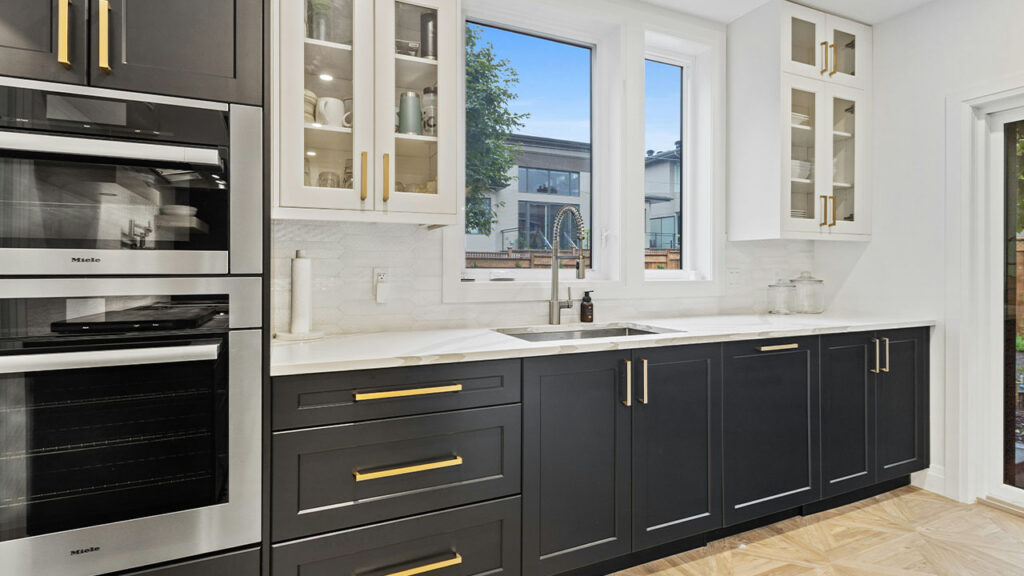
While black may seem like a bold choice, a deep charcoal shade can add instant sophistication without feeling harsh. It works particularly well on lower cabinets or as an accent color, providing a striking contrast against lighter countertops and backsplashes. Designers favor charcoal black because it brings depth and drama without making the kitchen feel too dark. When paired with metallic hardware and warm wood elements, it creates a balanced and upscale look. If you’re looking for a modern, statement-making shade that still feels timeless, charcoal black is a foolproof option.
This article was created with the assistance of AI but thoroughly edited by a human being.