A well-designed gallery wall can instantly transform a space, adding personality and charm without feeling outdated. While trendy layouts come and go, some timeless arrangements always maintain their appeal. Whether you prefer a structured grid, an eclectic mix, or a balanced asymmetrical design, these classic gallery wall layouts ensure a polished, stylish look that stands the test of time. Explore these 15 evergreen ideas to create a display that feels curated and intentional.
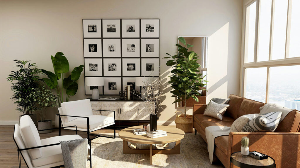
1. Classic Grid for a Clean and Symmetrical Look
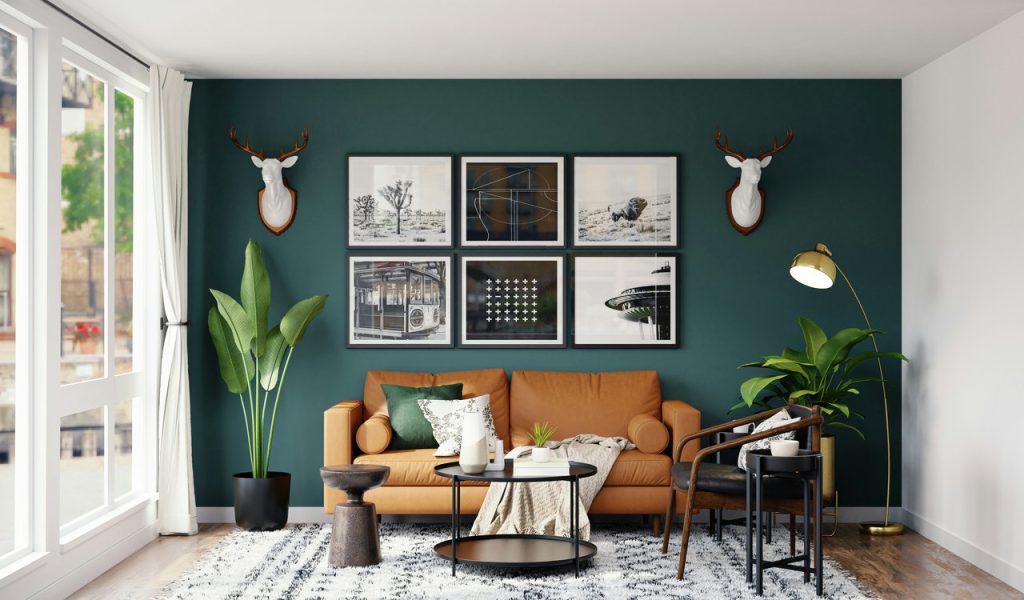
A classic grid layout creates a polished, structured gallery wall by arranging equal-sized frames in a neat, even spacing. This layout works well for showcasing photography, abstract prints, or uniform art collections, bringing a sense of order and sophistication to any room. Perfect for modern and traditional spaces alike, the grid design ensures a timeless, balanced aesthetic that never feels cluttered or overwhelming.
2. Linear Row for a Minimalist and Modern Aesthetic
A single-row gallery wall aligns frames in a straight horizontal or vertical line, offering a sleek, understated look. Ideal for hallways, above sofas, or dining areas, this layout maintains a sense of cohesion while emphasizing negative space. Whether featuring a series of black-and-white prints or bold artwork, a linear arrangement exudes modernity and ensures the pieces feel intentional rather than cluttered.
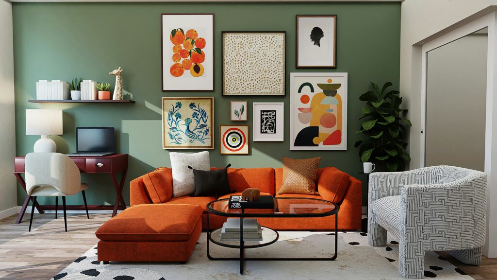
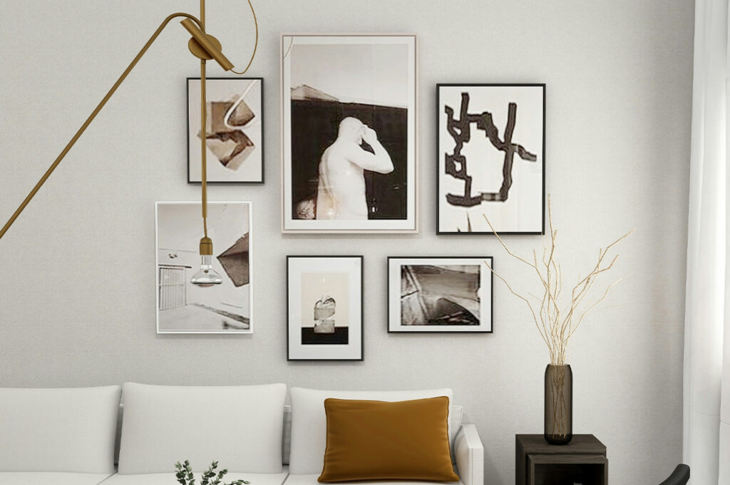
3. Salon-Style Arrangement for an Eclectic Feel
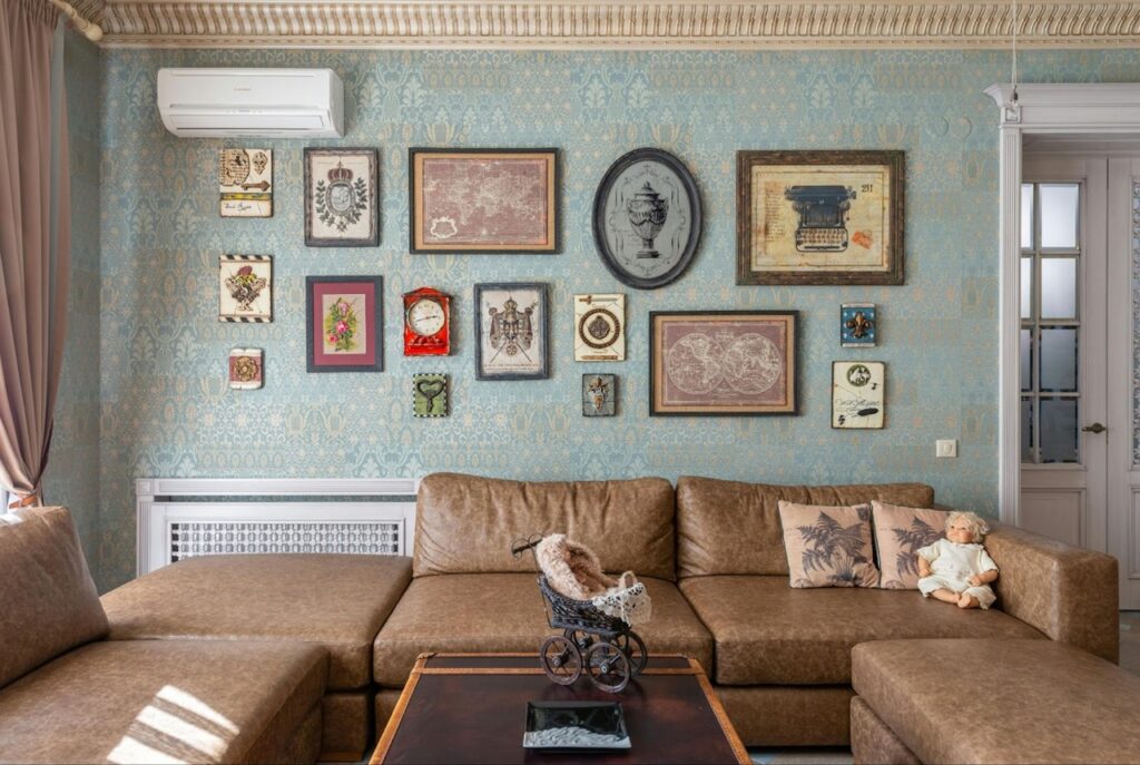
Inspired by historic European galleries, a salon-style layout layers artwork of varying sizes, colors, and frames for a collected-over-time aesthetic. This dynamic approach allows for personal expression, mixing portraits, landscapes, and abstract pieces in an organic yet curated manner. Perfect for maximalists, this style transforms a blank wall into an engaging focal point filled with personality.
4. Mirror Image Layout for Perfect Balance
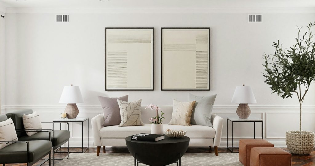
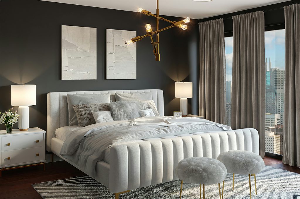
A mirror-image gallery wall places two identical arrangements side by side, creating symmetry and harmony. This layout works well above furniture like beds, sofas, or consoles, bringing a refined, structured elegance to the space. By using matching frames or complementary artwork, the design enhances visual balance, making the display feel cohesive and thoughtfully arranged.
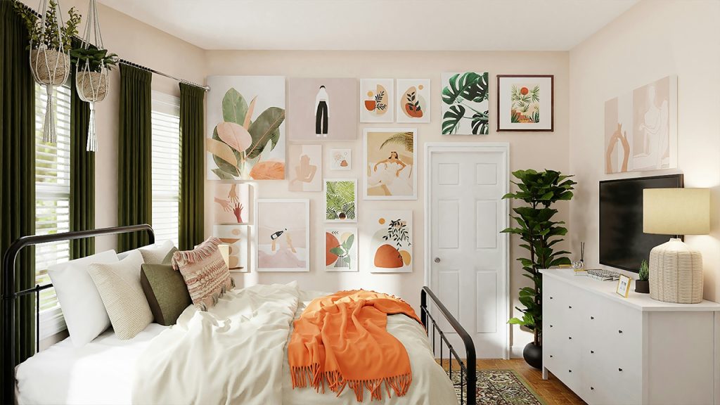
5. Asymmetrical Cluster for a Dynamic Display
An asymmetrical cluster layout arranges different-sized artworks in a seemingly random yet well-balanced composition. This layout allows for creative freedom, mixing various frames, styles, and subject matter while maintaining visual harmony. Ideal for adding movement and personality to a space, an asymmetrical arrangement keeps the eye engaged without feeling too rigid or formulaic.
6. Single Oversized Statement Piece for Impact
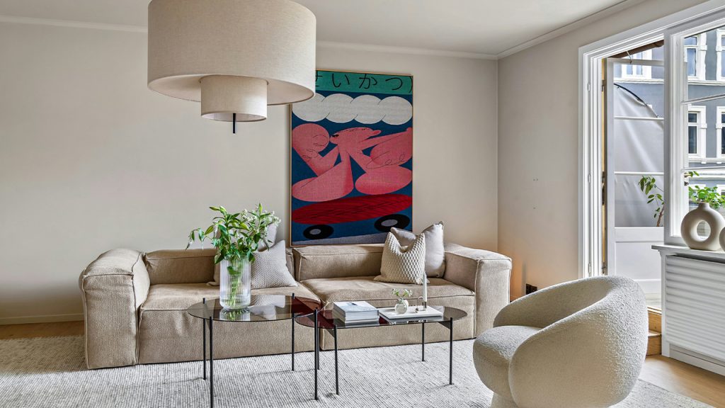
Opting for a single oversized piece instead of multiple smaller frames creates a bold focal point in any space. Whether it’s an abstract painting, a striking black-and-white photograph, or a large-scale print, this approach makes a dramatic impact without overwhelming the room. Ideal for minimalist interiors, a statement piece commands attention while maintaining a clean, uncluttered aesthetic.
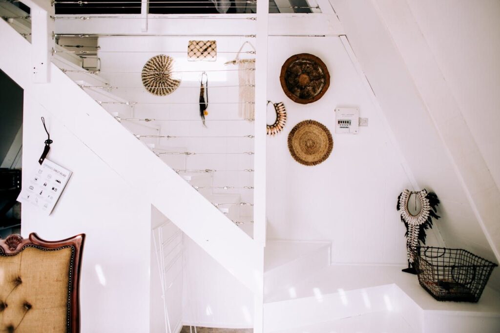
7. Corner Gallery for a Unique Wraparound Effect
A corner gallery layout extends artwork across two adjacent walls, creating an immersive, wraparound effect. This unexpected approach works particularly well in small spaces or reading nooks, making the most of an underutilized area. Mixing frame sizes and orientations enhances the organic flow, turning a forgotten corner into a visually captivating and personalized feature.
8. Floor-to-Ceiling Display for a Dramatic Touch
A floor-to-ceiling gallery wall maximizes vertical space, drawing the eye upward and making the room feel larger. This layout works well in living rooms, staircases, or hallways, offering a curated museum-like appeal. By combining a mix of framed artwork, photography, and typography, this arrangement transforms an empty wall into a striking visual statement that adds personality and depth.
9. Layered Ledge Shelving for Flexible Styling
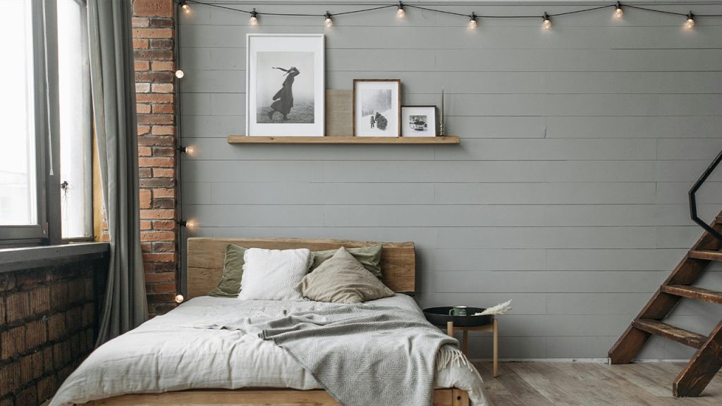
Instead of mounting frames directly on the wall, ledge shelving allows for a dynamic, ever-changing gallery display. Staggered shelves provide room for layering artwork of different sizes, along with decorative objects like vases or books. This versatile setup makes it easy to swap out prints seasonally or as tastes evolve, keeping the space fresh while maintaining a curated aesthetic.
10. Cohesive Color Theme for a Unified Look
A gallery wall with a consistent color palette ensures a harmonious, well-coordinated appearance. Whether sticking to monochromatic tones, muted neutrals, or a specific accent color, this approach ties the artwork together while allowing for variety in subject matter. By maintaining a cohesive color scheme, the gallery feels intentional and stylish rather than chaotic or mismatched.
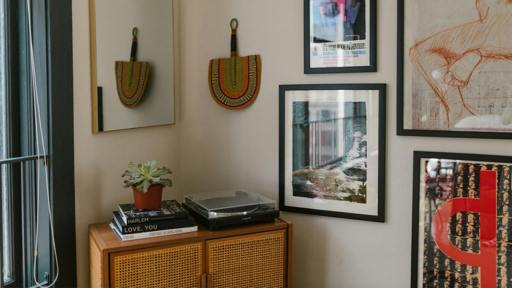
11. Mixed Media Display for Added Texture and Depth
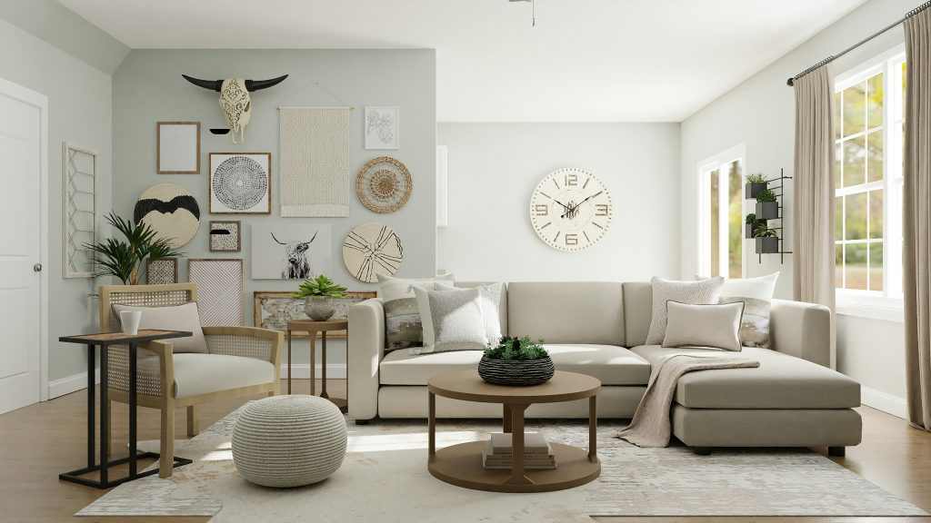
Incorporating a variety of materials—such as framed artwork, fabric hangings, sculptures, and mirrors—adds a rich, layered effect to a gallery wall. Mixing textures like wood, metal, and canvas brings dimension and prevents the display from feeling flat. This eclectic approach works well in bohemian, modern, or industrial spaces, making the wall a dynamic focal point full of personality.
12. Diagonal Flow for a Sense of Movement
Arranging frames in a diagonal pattern draws the eye along a natural visual path, making the space feel more dynamic. This layout is especially effective in stairwells, hallways, or sloped ceilings where a structured arrangement might not fit. By varying the size and orientation of pieces while maintaining a consistent theme, the gallery wall feels organic yet cohesive.
13. Frameless Art Collage for a Contemporary Edge
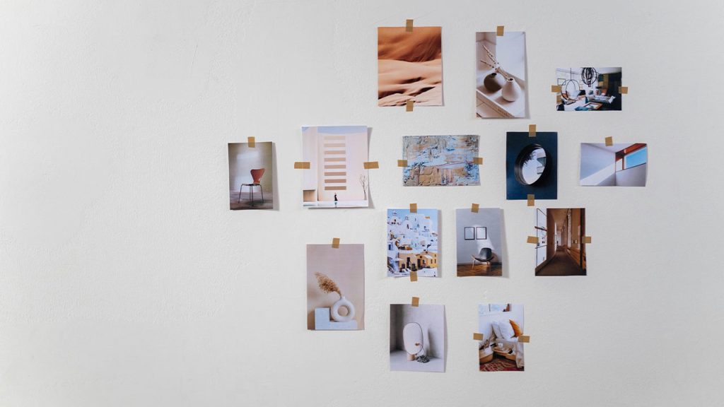
Skipping traditional frames and mounting prints or canvas pieces directly onto the wall creates a sleek, modern look. This casual, art-studio-inspired approach allows for greater flexibility in spacing and layering. Whether it’s a mix of abstract prints, photography, or typography, a frameless collage keeps the focus on the artwork itself, making it feel effortlessly curated.
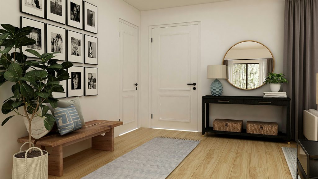
14. Black and White Photo Series for a Timeless Feel
A gallery wall composed entirely of black-and-white photographs exudes classic elegance. Whether featuring family portraits, travel snapshots, or vintage prints, the monochromatic palette ensures a clean, cohesive aesthetic. This layout works particularly well in modern, minimalist, or traditional interiors, offering a sense of nostalgia and sophistication.
15. Symmetrical Pairs for a Structured and Elegant Design
Arranging framed pieces in symmetrical pairs creates a sense of order and refinement. This approach is ideal for displaying complementary prints, architectural sketches, or nature-inspired artworks. Best suited for formal living rooms, bedrooms, or entryways, a symmetrical layout brings a polished, intentional feel to the space while maintaining balance and visual harmony.
This article was created with the assistance of AI but thoroughly edited by a human being.