Color has a profound impact on mood, making it a key element in home design. After a long, busy day, the right color palette can instantly create a sense of calm, energy, or comfort. Whether you prefer soft neutrals, warm earth tones, or vibrant hues, the right combination can transform your space into a personal retreat. These 14 mood-boosting color palettes will help you design a home that feels welcoming, uplifting, and perfectly suited to your lifestyle.
1. Soft Neutrals for a Serene Retreat
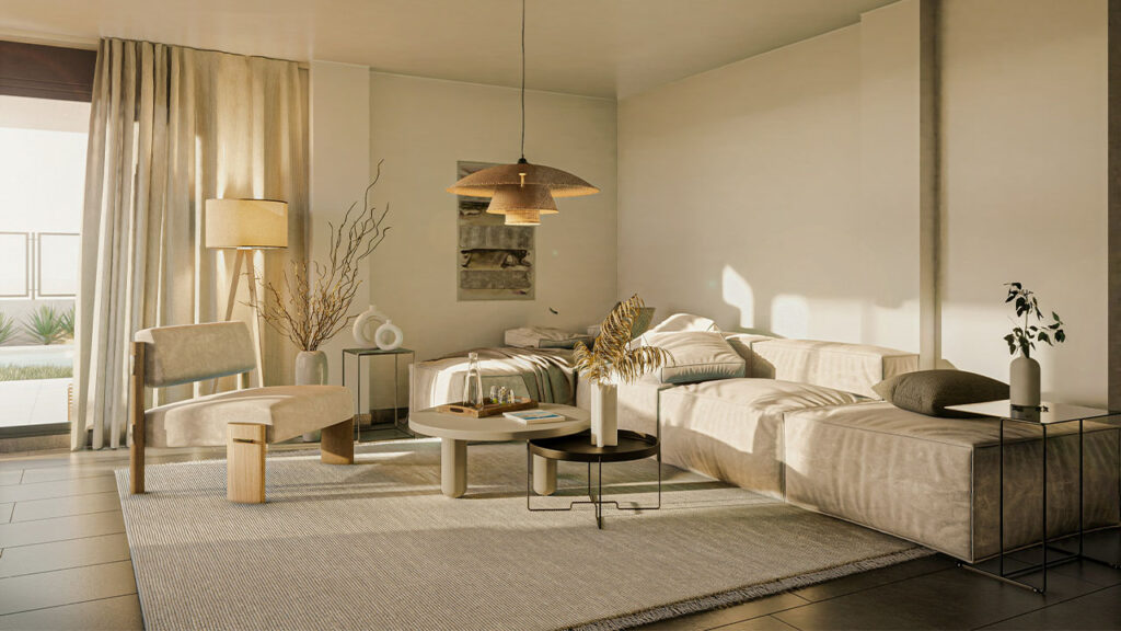
Soft neutrals like warm whites, beige, and light taupe create a peaceful, grounding atmosphere. These shades allow natural light to bounce gently across the room, enhancing the sense of openness. Pairing them with cozy textures such as linen, wool, or light wood tones adds warmth without overwhelming the space. Perfect for bedrooms and living areas, this palette promotes relaxation and serves as a timeless foundation for layering subtle accents.
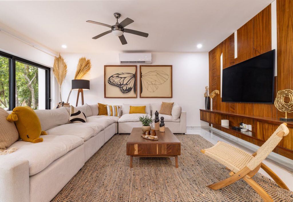
2. Warm Earth Tones for a Cozy Ambiance
Rich browns, deep terracotta, and warm ochre hues bring a sense of comfort and intimacy to any space. These colors evoke the natural beauty of the outdoors, making your home feel grounded and inviting. Incorporate leather furniture, wooden accents, and woven textiles to enhance the warmth. Whether in a living room or bedroom, this palette creates a cocooning effect, perfect for unwinding after a long day.
3. Calming Blues for a Tranquil Escape
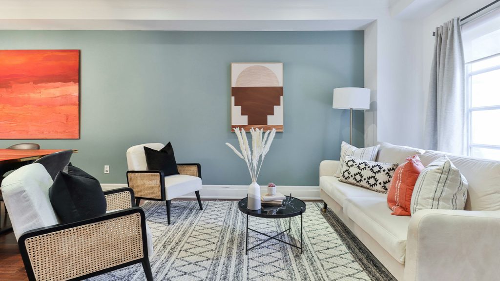
Soft blues, from powdery sky shades to deep ocean tones, have a naturally soothing effect, ideal for bedrooms and bathrooms. This palette mimics the serenity of water and sky, promoting relaxation and mental clarity. To prevent a space from feeling too cool, balance the blues with warm wood tones, brass accents, or soft beige textiles. The result is a peaceful retreat that encourages deep breaths and a calm mind.
4. Sunny Yellows to Uplift and Energize
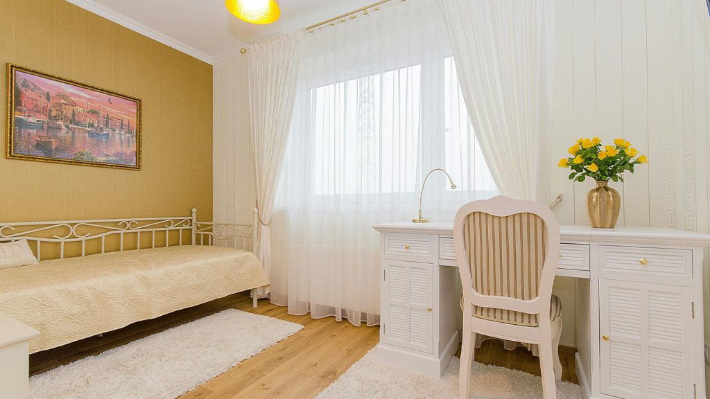
Bright and cheerful, yellow hues like buttercream, goldenrod, or soft mustard instantly boost mood and add warmth to a space. Ideal for kitchens, dining rooms, or entryways, yellow creates an inviting atmosphere filled with positivity. Pair with crisp white or muted gray to keep the look sophisticated rather than overwhelming. Adding natural light enhances the vibrancy, making your home feel welcoming and full of life.
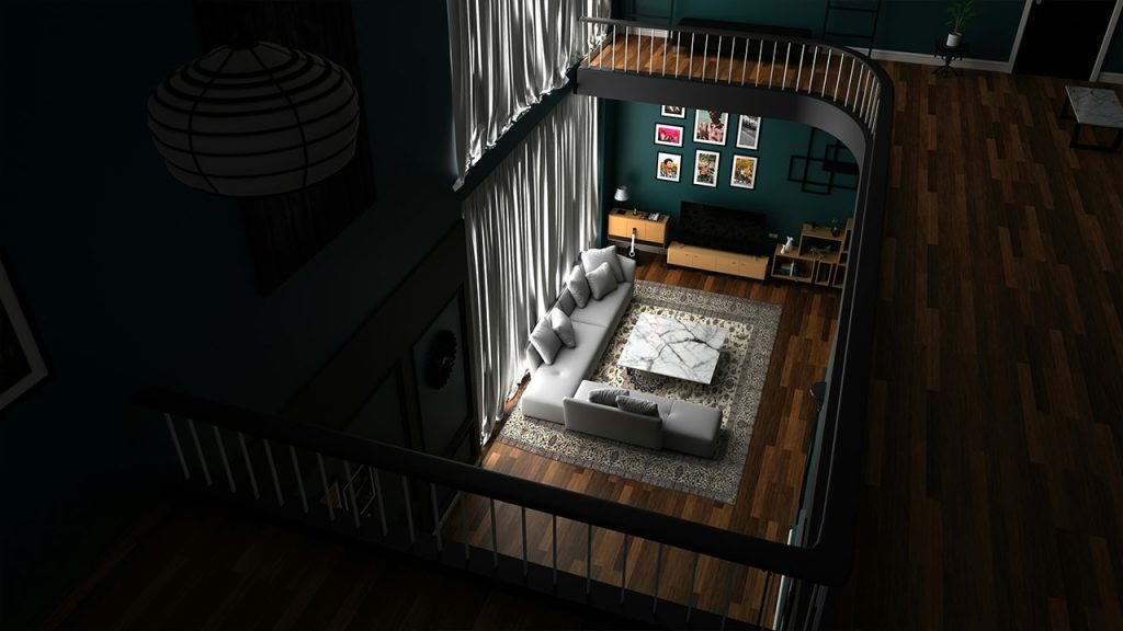
5. Muted Greens for a Natural, Refreshing Feel
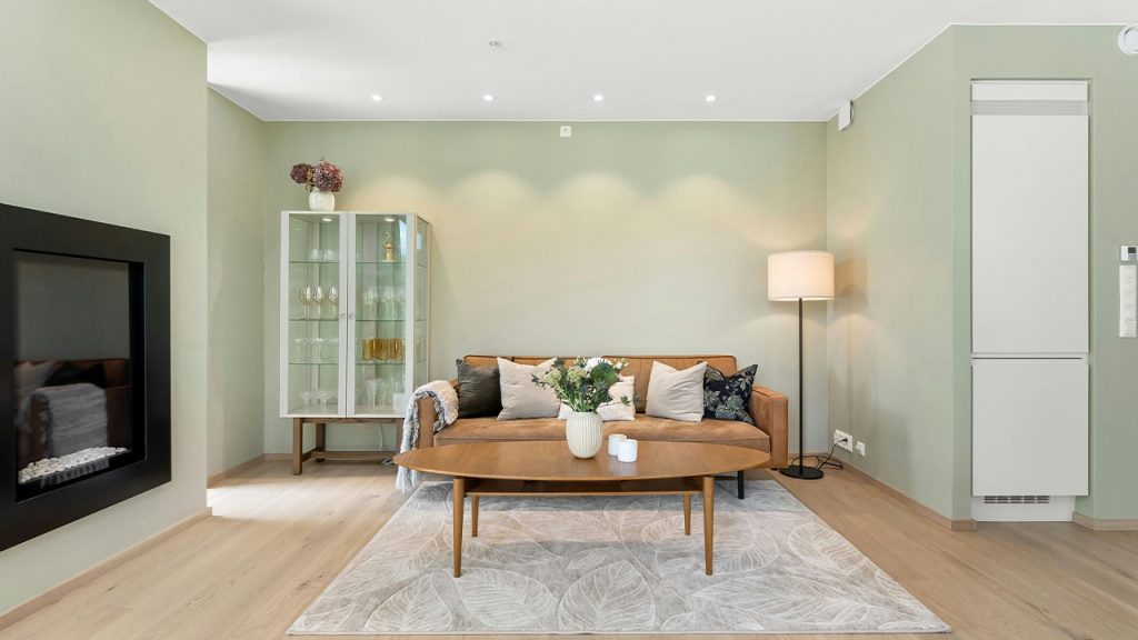
Soft sage, olive, and mossy greens bring a sense of balance and renewal, reminiscent of lush landscapes. These colors work beautifully in living rooms, home offices, or bedrooms, offering a refreshing backdrop without being overpowering. Pair with natural elements like rattan, stone, or soft ivory tones to maintain an organic aesthetic. This palette is perfect for those who crave a calming connection to nature indoors.
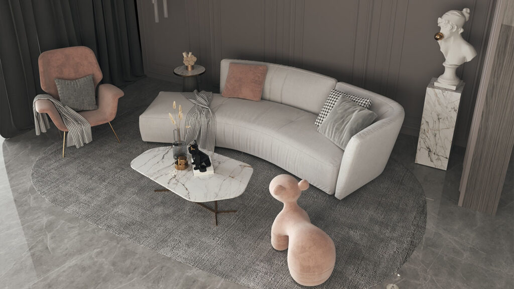
6. Blush and Peach Tones for a Gentle Warmth
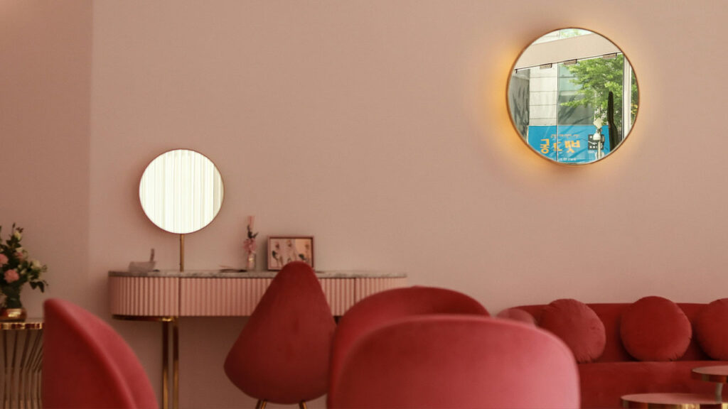
Soft blush and peach tones add a delicate warmth to any space, creating a cozy yet airy ambiance. These hues work beautifully in bedrooms, nurseries, or living rooms, offering a subtle touch of color without overwhelming the decor. Pair them with neutral whites, warm wood finishes, or soft metallic accents for a modern, sophisticated look. The result is an inviting space that feels fresh, comforting, and effortlessly elegant.
7. Rich Jewel Tones for a Luxurious Touch
Deep emerald greens, sapphire blues, and ruby reds bring a bold, opulent feel to interiors. These saturated hues add drama and sophistication, making them perfect for accent walls, upholstered furniture, or statement decor pieces. To maintain balance, pair jewel tones with neutral backdrops or warm metallics like gold and brass. Whether in a dining room or bedroom, this palette creates a space that feels rich, vibrant, and timeless.
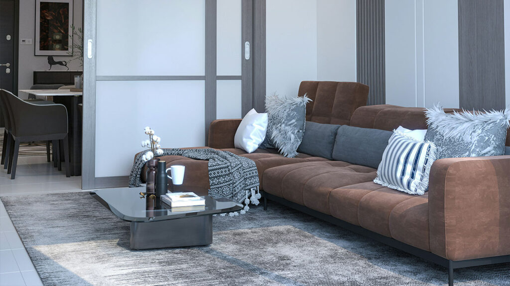
8. Cool Grays with Pops of Color for Balance
Soft gray tones create a neutral foundation that allows colorful accents to shine. Whether paired with bold mustard, deep navy, or vibrant coral, this palette brings modern sophistication with just the right amount of energy. Ideal for contemporary living rooms or home offices, cool grays keep the space feeling sleek and refined while allowing for versatility. Layer in textures like velvet cushions or patterned rugs to enhance depth and warmth.
9. Terracotta and Rust for an Inviting Vibe
Earthy terracotta and rust tones infuse spaces with warmth, making them feel cozy and grounded. These rich, sunbaked hues work beautifully in bohemian or rustic interiors, complementing natural materials like clay, rattan, and wood. Use them on accent walls, textiles, or ceramics to create a welcoming environment. When paired with creamy neutrals or deep greens, terracotta tones add depth and a sense of well-traveled charm to any space.
10. Lavender and Lilac for a Soft, Dreamy Atmosphere
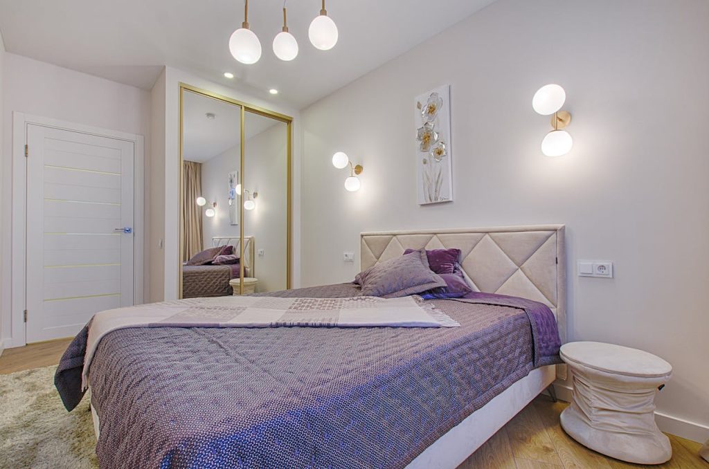
Shades of lavender and lilac bring a soothing, ethereal quality to interiors, perfect for bedrooms or reading nooks. These pastel hues evoke a sense of calm while adding a touch of playful elegance. Pair them with crisp white, muted gray, or soft gold accents to maintain a refined yet dreamy aesthetic. Whether through wall paint, plush textiles, or floral arrangements, these hues create a relaxing retreat that feels light and uplifting.
11. Crisp Whites with Soft Pastels for a Light, Airy Feel
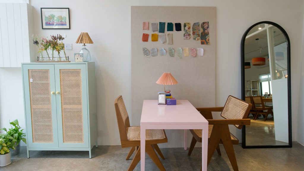
A palette of crisp whites and soft pastels creates a fresh, open atmosphere that feels effortlessly elegant. Light hues like blush pink, sky blue, and mint green bring a subtle touch of color while maintaining a serene, uncluttered look. This combination is perfect for small spaces, as it reflects light and enhances the sense of openness. Pair pastel accents with white-washed wood and delicate textiles for a dreamy, airy aesthetic that feels both refreshing and timeless.
12. Deep Navy and Charcoal for a Sophisticated Mood
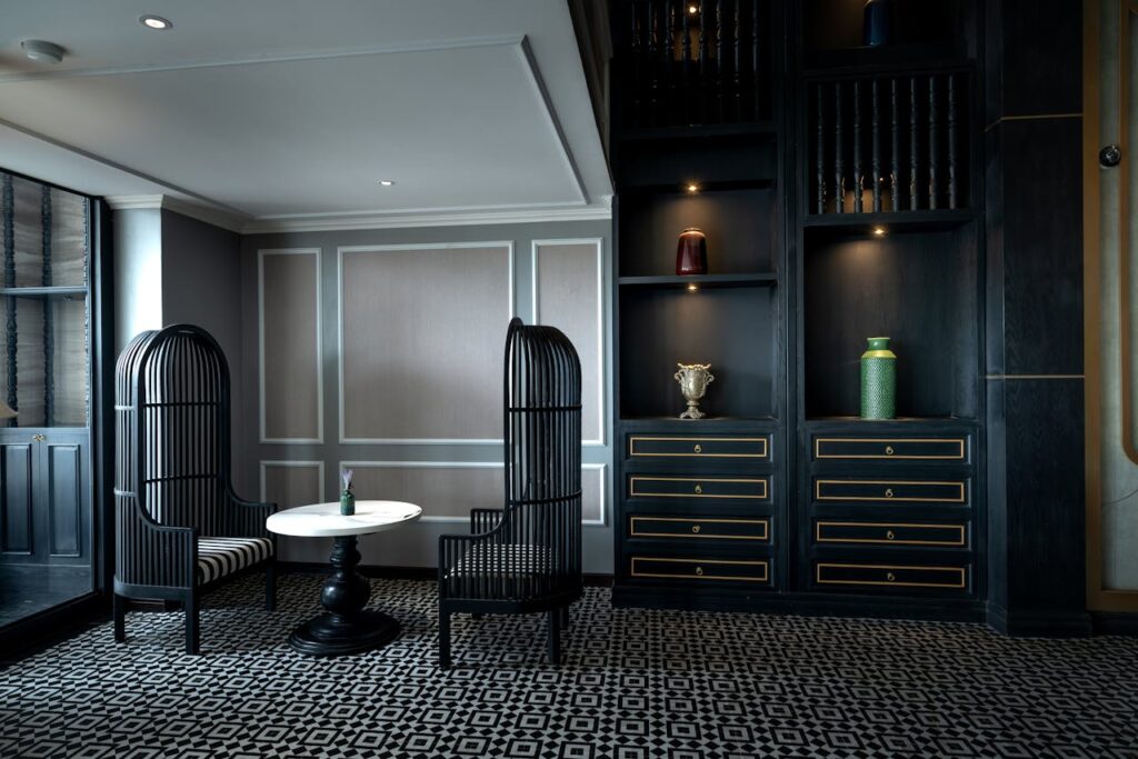
Rich, moody shades of deep navy and charcoal exude elegance and depth, perfect for creating a refined, modern ambiance. These bold neutrals work well in living rooms, bedrooms, or offices, offering a grounded feel without being overwhelming. Pair them with warm metallics like brass or gold for contrast, or soften the look with plush fabrics like velvet and wool. The result is a space that feels intimate, stylish, and effortlessly chic.
13. Vibrant Corals and Teals for a Playful, Energizing Space
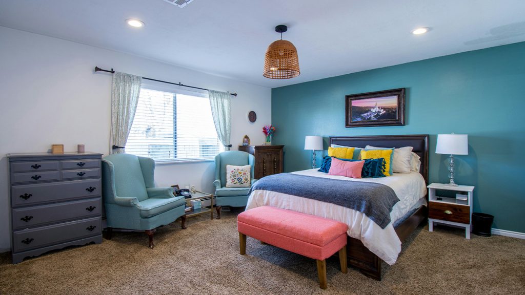
Bold coral and teal hues add a burst of personality, making spaces feel lively and energetic. This dynamic palette works beautifully in creative spaces, dining areas, or kids’ rooms, where a sense of fun and vibrancy is desired. To balance the boldness, incorporate neutral furnishings or natural textures like woven baskets and wooden elements. Whether used as accent walls, upholstery, or decor, these colors inject instant joy and playfulness.
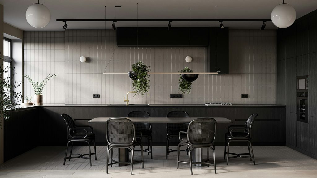
14. Moody Dark Hues for a Cozy, Dramatic Effect
Deep shades like forest green, plum, and espresso create an intimate, cocoon-like atmosphere perfect for relaxation. These dark tones add depth and a sense of sophistication, making them ideal for bedrooms, reading nooks, or dining rooms. To keep the space from feeling too heavy, balance the look with warm lighting, rich textiles, and metallic or glass accents. The result is a cozy retreat that feels both bold and inviting.
This article was created with the assistance of AI but thoroughly edited by a human being.