A bedroom should feel like a sanctuary—a space for relaxation, rest, and rejuvenation. While color plays a crucial role in setting the mood, some hues can have the opposite effect, making it harder to unwind or even affecting sleep quality. Certain shades can feel too intense, overwhelming, or just plain outdated, creating an atmosphere that feels anything but restful. Experts agree that choosing the wrong paint color can impact the ambiance of your bedroom, so here are 12 colors you should avoid if you want a peaceful and stylish retreat.
1. Bright Red: Too Energizing for Sleep
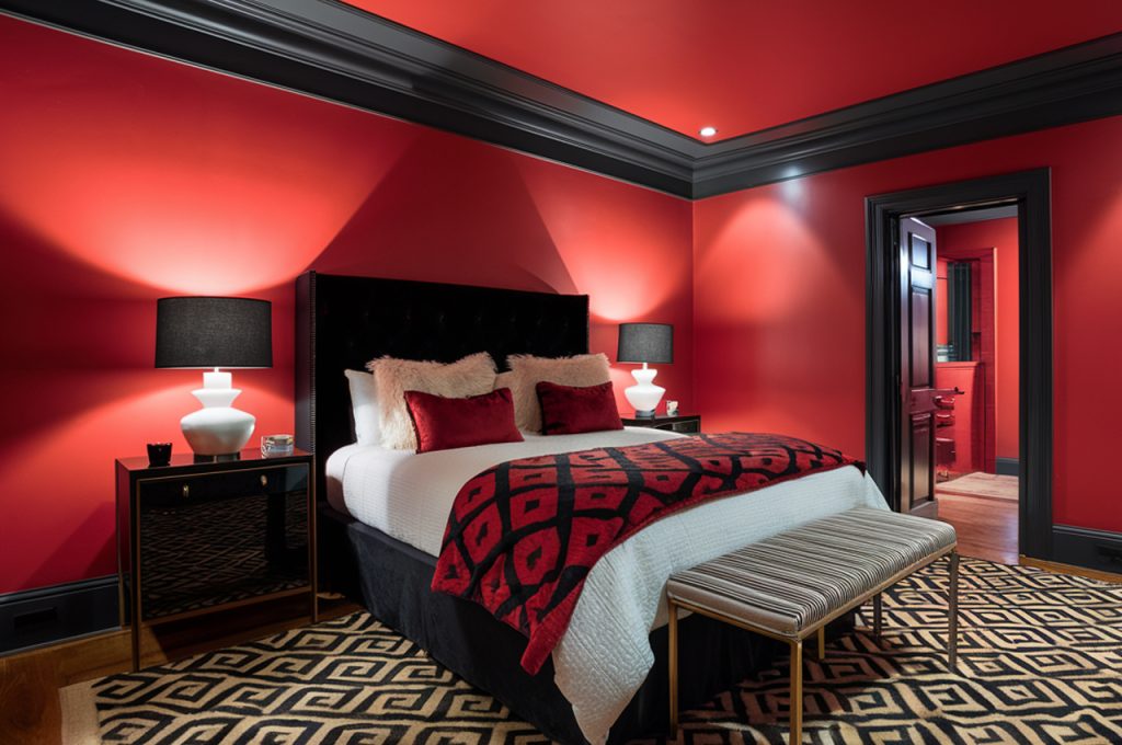
Red is often associated with passion and energy, which makes it a poor choice for a restful bedroom. This bold hue can increase heart rate and stimulate the mind, making it harder to relax at night. While deep, muted reds might work in other spaces, bright red can feel overwhelming, especially in a room meant for unwinding. Instead of fiery reds, consider soft terracotta or warm taupe for a cozy yet sophisticated look. If you love red, use it in small accents rather than wall color to maintain a calming atmosphere.
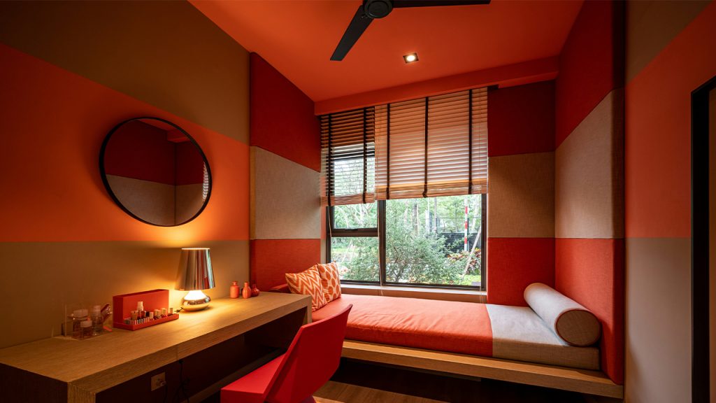
2. Vibrant Orange: Overly Stimulating

Orange exudes warmth and energy, but its vibrancy can be too stimulating for a space meant for sleep. Shades like tangerine or neon orange can feel jarring, making it difficult to wind down. Since orange has strong associations with excitement and creativity, it works better in lively areas like kitchens or home gyms. If you’re drawn to warm tones, opt for muted peach, soft apricot, or earthy rust, which bring warmth without overwhelming the senses. Subtle orange undertones in neutral shades can add a cozy touch without being overpowering.
3. Stark White: Cold and Uninviting
While white is often seen as a safe and neutral choice, stark white walls can make a bedroom feel clinical and unwelcoming. Without the right undertones, pure white can feel too harsh, lacking the warmth needed for a cozy retreat. Additionally, bright white walls reflect too much light, which may create an overly stimulating environment. If you prefer a light and airy feel, consider off-whites with warm undertones like ivory, cream, or soft greige. These shades maintain the crisp look of white while adding depth and warmth to the space.
4. Electric Blue: Too Intense for Relaxation

Blue is generally considered a calming color, but overly bright shades like electric blue or neon turquoise can have the opposite effect. These intense hues can feel too energetic for a sleep-friendly space, making the room feel more like a high-energy playroom than a tranquil retreat. To achieve a serene atmosphere, opt for softer blues like powder blue, muted denim, or misty gray-blue. These variations still offer a soothing effect without the overwhelming brightness that can disrupt relaxation.
5. Deep Purple: Too Dark and Moody
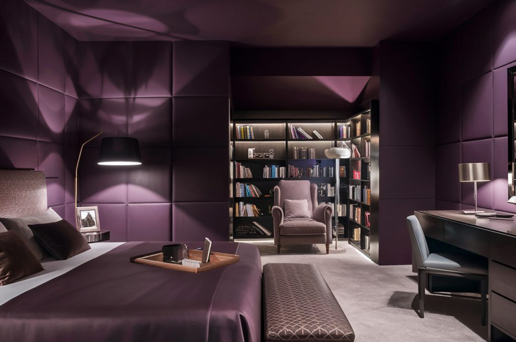
Rich purple tones like royal purple or eggplant can feel luxurious, but they can also create a heavy, overly dramatic atmosphere in a bedroom. Dark purple tends to absorb light, making small bedrooms feel even more confined and cave-like. While some deep hues can work in a moody design, purple’s intensity can make it less suitable for relaxation. Instead, consider softer lavenders or dusty mauves that bring in the elegance of purple without feeling too dark or overpowering. These lighter variations add a touch of sophistication while maintaining a calming effect.
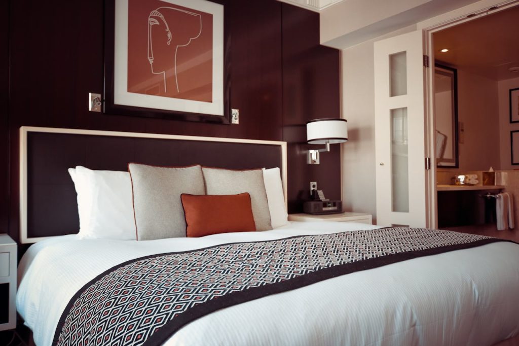
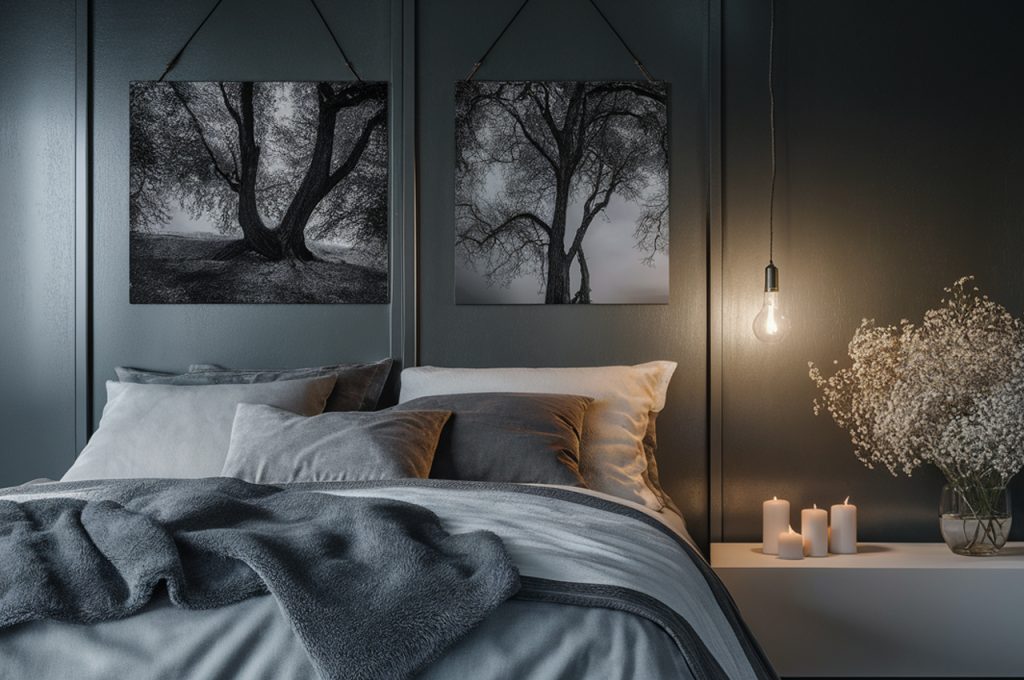
6. Jet Black: Overwhelming and Heavy
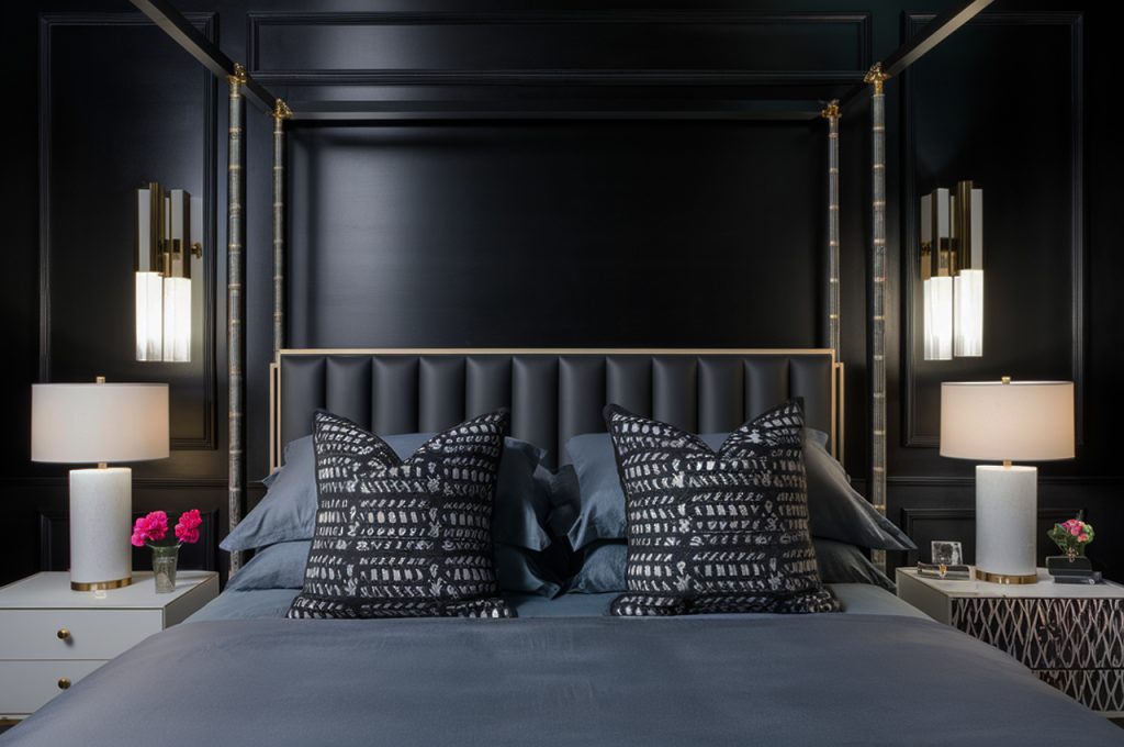
While black can add drama and sophistication to a space, covering bedroom walls in jet black can create a heavy, enclosed feeling. This dark shade absorbs light rather than reflecting it, making rooms feel smaller and gloomier. It can also evoke a sense of isolation rather than relaxation. If you love the boldness of black, consider using it as an accent color rather than a primary wall shade. Charcoal gray or deep navy can provide a similar moody aesthetic while maintaining a more inviting and restful atmosphere.
7. Neon Green: Distracting and Overpowering
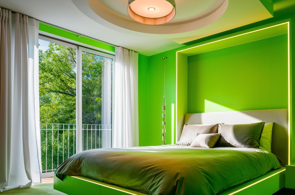
Green is often linked to nature and serenity, but neon or lime green can be overstimulating, especially in a bedroom. These shades are too intense for a restful environment, making it difficult to relax and fall asleep. Instead of bright, artificial greens, opt for soft sage, olive, or moss green. These muted, earthy tones bring the same sense of nature into your space while promoting a peaceful and calming ambiance that encourages restful sleep.
8. Sunshine Yellow: Too Cheerful for Rest
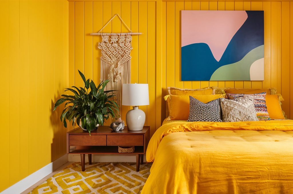
While yellow is associated with happiness and warmth, bright shades like lemon or sunflower yellow can be too energizing for a bedroom. These hues stimulate the mind rather than encourage relaxation, potentially making it harder to unwind at night. If you enjoy the warmth of yellow, consider subtle alternatives like buttery cream or muted gold. These softer shades retain a cozy, cheerful feel without overwhelming the senses, allowing your bedroom to remain a soothing retreat.
9. Hot Pink: Playful but Overstimulating
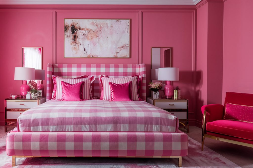
Hot pink is often seen in children’s rooms or trendy spaces, but its high-energy effect can be overwhelming in a bedroom. This vibrant hue stimulates the brain, making it difficult to relax and unwind. Even in small doses, it can feel overpowering, especially when used on large wall surfaces. If you love pink but want a more soothing alternative, opt for dusty rose, blush, or muted coral. These softer variations maintain a stylish and feminine touch while creating a more tranquil atmosphere.
10. Dark Brown: Too Heavy and Dated
Dark brown can make a bedroom feel heavy, outdated, or even claustrophobic, especially in smaller spaces. While earthy tones are popular for warmth, deep chocolate or espresso brown can absorb too much light, creating a dull and uninviting environment. Instead, choose warm neutrals like tan, beige, or light mocha. These shades offer the grounding effect of brown without making the space feel overly dark or closed in, resulting in a cozy yet refreshing bedroom.
11. Steel Gray: Too Cool and Unwelcoming
Gray is a popular neutral, but overly cool-toned grays, like steel or concrete gray, can make a bedroom feel cold and uninviting. These shades often lack the warmth needed for a cozy retreat, making the space feel sterile rather than restful. To keep the elegance of gray without the starkness, opt for warmer grays with beige or taupe undertones. Greige (a mix of gray and beige) is a great alternative, offering a sophisticated yet cozy feel that works beautifully in a bedroom.
12. Bright Teal: Too Loud for Relaxation
Teal is a striking color, but when used in its brightest shades, it can be too bold for a calming bedroom environment. Vibrant teal tends to energize rather than soothe, making it a better fit for an office or creative space rather than a restful retreat. If you’re drawn to teal, opt for muted versions like soft seafoam, dusty blue-green, or deep peacock. These tones maintain the richness of teal while promoting a more tranquil and balanced atmosphere.
This article was created with the assistance of AI but thoroughly edited by a human being.