Tiles are a staple in home design, offering durability and style, but the wrong color can instantly age your space. While trends evolve, certain tile shades feel stuck in the past, making a home look outdated rather than timeless. If you’re planning a renovation or looking to refresh your space, avoiding these dated tile colors can help keep your interiors looking fresh and modern. From overly bold hues to faded neutrals, here are ten tile colors that may be dragging down your home’s aesthetic.
1. Pepto Pink Overload

Once popular in mid-century bathrooms, Pepto-pink tiles now scream outdated rather than retro-chic. This bubblegum hue was a staple in the 1950s but has since lost its charm in modern interiors. While vintage aesthetics are making a comeback, pink tiles often clash with contemporary design elements, making bathrooms and kitchens feel stuck in the past. If you love pink, consider muted or blush tones that feel more sophisticated and easier to coordinate with modern finishes like brass and marble.
2. Dull Beige That Lacks Character

Beige tiles were once the go-to neutral for floors and backsplashes, but many older variations lack warmth and depth. The flat, yellowish-beige shades commonly found in homes built in the ’90s and early 2000s can make a space feel uninspired and tired. Today, designers favor warmer, earthier neutrals like greige or taupe, which offer a more sophisticated and layered look. Swapping out dull beige for a richer neutral can instantly refresh your space and make it feel more current.
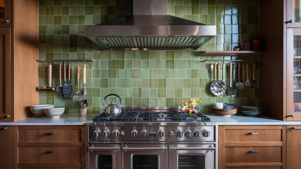
3. Forest Green Throwback
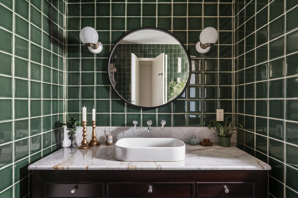
Dark green tiles had their moment in the 1980s and ’90s, particularly in bathrooms and kitchens, but this moody shade often makes spaces feel cramped and dated. While green remains a popular color in modern design, today’s trends lean toward soft sage and olive tones, which feel more organic and timeless. If your home still has deep forest green tile, consider lightening up the space with fresh neutrals or swapping it for a muted green that complements natural wood and light countertops.
4. Mustard Yellow From Another Era
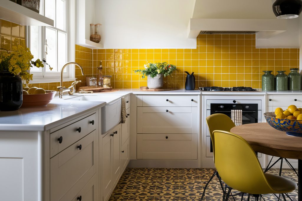
Mustard yellow tiles, especially those seen in vintage kitchens and bathrooms, have a way of making a space feel like a relic of the past. While warm tones are making a comeback, the dull, brownish-yellow of decades past can feel heavy and uninviting. If you love yellow, consider a more refined shade like pale gold or a sun-washed hue that adds warmth without overwhelming the space. Pairing it with crisp white or modern textures can help keep the look fresh rather than outdated.
5. Terracotta Orange Overload
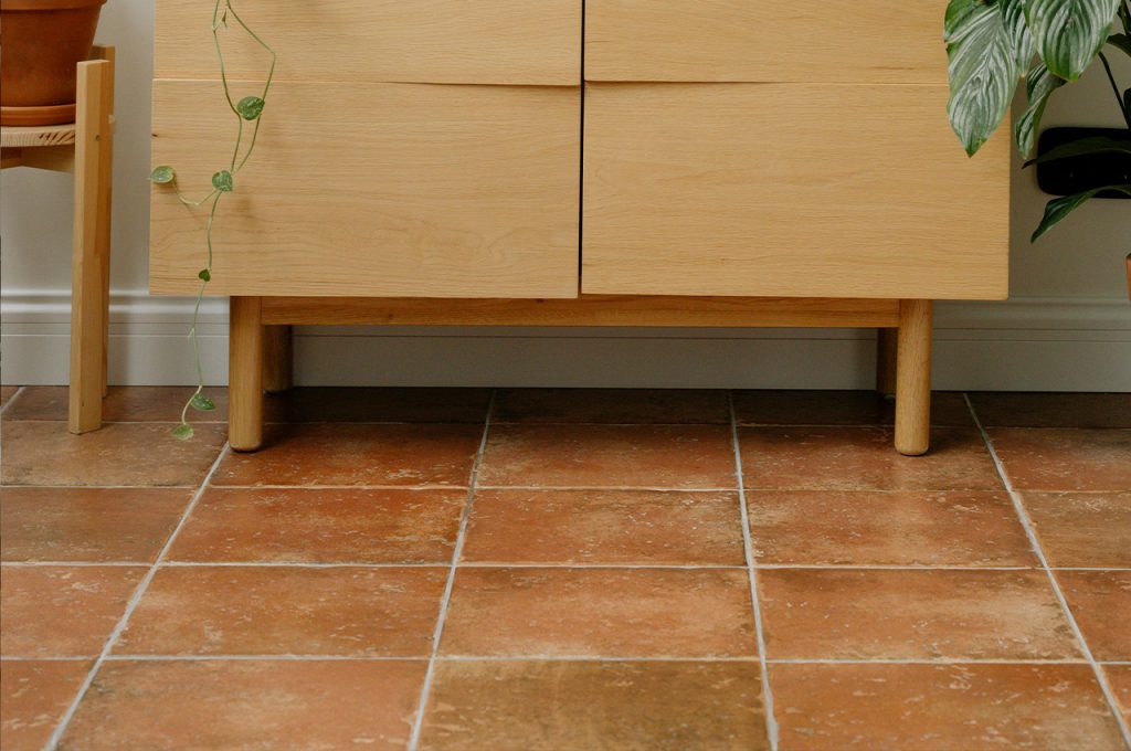
Terracotta tile has roots in traditional Spanish and Mediterranean design, but when overused—especially in deep, burnt-orange shades—it can make a home feel like a time capsule from the ’70s. While natural terracotta is still beloved for its texture and warmth, overly saturated orange tiles can feel overwhelming. A modern approach is to use terracotta in moderation or opt for more subdued clay tones that bring warmth without overpowering the space.
6. Baby Blue Bathroom Blues

Once a staple in mid-century bathrooms, baby blue tiles now feel more nostalgic than stylish. While pastel hues have their charm, baby blue often clashes with modern fixtures and color palettes, making a space feel like a throwback rather than a fresh design choice. If you love blue, consider deep navy or soft slate shades, which offer a more sophisticated and timeless look. Pairing these with neutral tones or natural stone can keep your space feeling fresh while still embracing a hint of color.
7. Avocado Green Left in the Past

Avocado green was a favorite in the 1960s and ’70s, often used in kitchens and bathrooms alongside equally dated appliances. While green is making a strong comeback, this muddy, yellow-toned shade tends to drag a space down rather than enhance it. Today’s take on green leans toward fresher hues like eucalyptus and emerald, which feel more refined. If you’re stuck with avocado green tile, balancing it with crisp white or modern wood tones can help soften its retro effect.
8. Burgundy That Feels Too Heavy

Deep burgundy tiles were once seen as an elegant and bold choice, but in today’s interiors, they often feel dark and outdated. Their rich, red undertones can make a space look heavy and visually overwhelming, especially in smaller bathrooms or kitchens. Instead of burgundy, consider using warm terra cotta, dusty rose, or wine-inspired shades with a more muted, earthy appeal. Lighter, textured finishes can make a space feel warm and inviting without the overwhelming heaviness of old-school burgundy tile.
9. Gray That Feels Too Cold
While gray tiles were the height of home design trends in the early 2010s, some shades now feel too sterile and overused. Particularly, cold-toned grays with blue or purple undertones can make a space feel uninviting rather than modern. Warmer grays and greige (a blend of gray and beige) have become the preferred choice, offering a more balanced, timeless feel. If you want to modernize a gray-heavy space, introducing warmer textures like wood or brass can help bring depth and warmth.
10. High-Gloss Black That Shows Everything
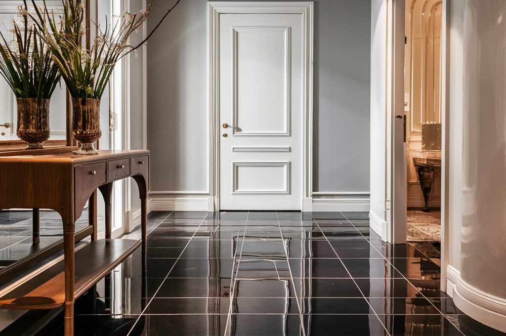
Black tiles can be sleek and dramatic, but high-gloss black, especially when covering large surfaces, can feel overly harsh and impractical. These tiles tend to show every speck of dust, water spot, and fingerprint, making maintenance a constant battle. While black can be a stylish choice, a matte finish or textured charcoal alternative offers a more sophisticated and low-maintenance option. Pairing black tiles with lighter elements, such as natural stone or warm wood, helps balance the intensity and keeps the space feeling modern rather than oppressive.
This article was created with the assistance of AI but thoroughly edited by a human being.