Color is one of the most powerful tools in interior design it can make a room feel fresh and modern or transport you straight back to a dated era. While some palettes age like fine wine while others are not. We’ve all stepped into a space and felt like we entered a time capsule, and more often than not, outdated color schemes are to blame. Whether you’re updating your own home or just love to stay in the know, here are 10 color combos that are quietly dragging interiors back in time and not in a charming, retro way.
1. Tuscan Red and Gold
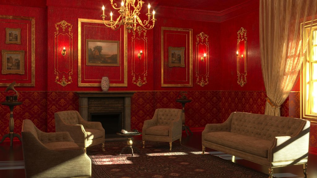
In the early 2000s, this color combo was the height of suburban “luxury” deep reds and brassy golds filled homes, channeling a faux-Tuscan bistro vibe that felt rich and dramatic. Kitchens, dining rooms, and even bathrooms wore the look proudly. But what once felt warm and opulent now feels dated and heavy. Today’s design trends lean toward lighter, airier palettes that bring a sense of calm and openness. Compared to that, this scheme feels stuffy and overdone. It had its moment, but its time has definitely passed.
2. Mint Green and Peach
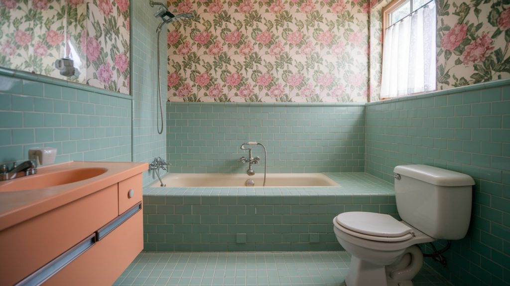
This pastel duo think baby pink and powder blue had its heyday in the ’80s and early ’90s. Back then, it was all about creating soft, serene spaces. It feels more like a dentist’s waiting room than a cozy, stylish retreat. These shades, when paired, often wash each other out, leaving rooms feeling flat and uninspired. While they once symbolized calm, today they lack the richness and personality that modern interiors crave. Design has evolved and unfortunately, this combo just didn’t keep up.
3. Brown and Burnt Orange
Reminiscent of shag carpets and avocado-green kitchens, this earth-tone combo screams ’70s throwback in the not-so-chic way. While earthy hues are making a stylish comeback, this particular pairing often misses the mark. Instead of feeling warm and grounding, it leans muddy and lifeless, draining the energy from a space. It’s the kind of palette that makes a room feel dated rather than nostalgic, more drab than cozy. A little retro flair can be fun, but this duo needs a serious refresh to avoid looking like a blast from the past in the worst way.
4. Black and Red
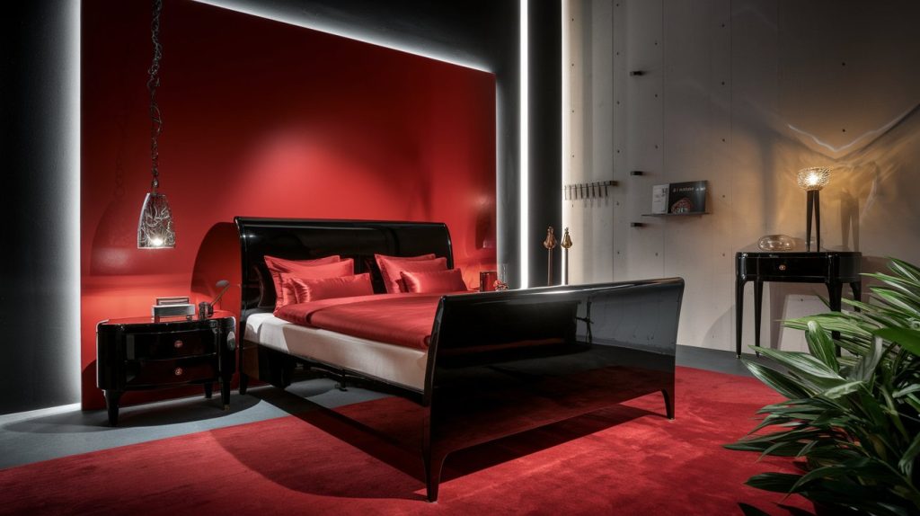
Once a bold staple in bachelor pads and edgy spaces of the early 2000s, this high-contrast duo now feels more harsh than stylish. What was once cool and dramatic can now come off as stark and uninviting, adding tension instead of charm. Times have changed, and so have tastes, people are craving warmth, softness, and balance in their homes. While this combo had its moment, it’s starting to feel a bit dated. If you’re looking for a timeless vibe that truly feels good to live in, it might be time to explore other options.
5. Country Blue and Mauve
Back in the ’80s, soft, dusty hues were everywhere, think cozy, romantic vibes straight out of a storybook. It was charming then, all ruffled curtains and floral stencils. But today, that same palette can feel a little tired. Nostalgia has its place, sure, but if you still love those dreamy tones, try giving them a fresh spin. Pair them with clean lines, natural textures, and modern accents to keep the warmth, without the outdated feel. It’s all about blending past and present in a way that feels timeless.
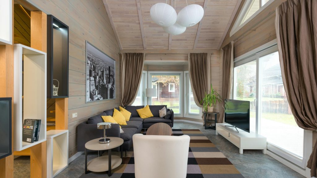
6. Beige-on-Beige
Beige used to say “sophisticated minimalism,” but these days, it can come off a bit dull. Without contrast, texture, or a pop of color, an all-beige room risks feeling flat and forgettable like it’s trying too hard to play it safe. It’s not that beige is bad; it just needs a little help to shine. Add a cozy texture, a bold accent, or a splash of color, and suddenly the space feels warm, lived-in, and full of personality. Beige can still be beautiful, it just needs a spark to bring it back to life.
7. Forest Green and Burgundy
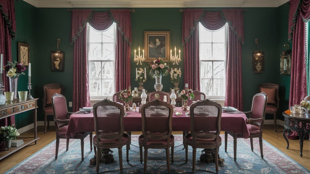
Back in the late ’80s and early ’90s, this once regal color combo was everywhere paired with dark wood furniture and plush, heavy fabrics. It gave off serious luxury vibes at the time, but today, putting them together can feel more vintage hotel lobby than timeless elegance. Each color still works beautifully on its own, but together, they can read a bit dated. If you’re not leaning into a retro look, try softening the palette with lighter tones or mixing in modern accents to keep things fresh and current.
8. Yellow and Baby Blue
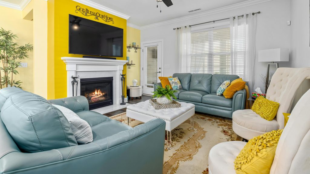
This color combo aims to feel cheerful and playful, but it can easily come off as childish or overly sweet. It brings back memories of nurseries or early 2000s apartments nostalgic, sure, but not always in a great way. Without a modern touch or thoughtful styling, it risks feeling immature or outdated. It’s a tricky balance, what should be fun and fresh can quickly turn tacky if you’re not careful. With the right approach though it can shine, it just needs intention, contrast, and a little grown-up edge to truly work.
9. Gray and Greige Overload
Gray had its time in the spotlight as the go-to neutral, but let’s be honest it’s starting to feel a little tired. Entire rooms soaked in gray or greige can come off cold and lifeless. What once felt modern and sleek now feels like a safe, copy-paste choice. The overuse has stripped it of personality, making spaces feel more like showrooms than lived-in homes. It’s time to move beyond the gray zone and bring back warmth, character, and a little risk into our spaces. Your home should feel like you, not a trend.
10. Lavender and Sage
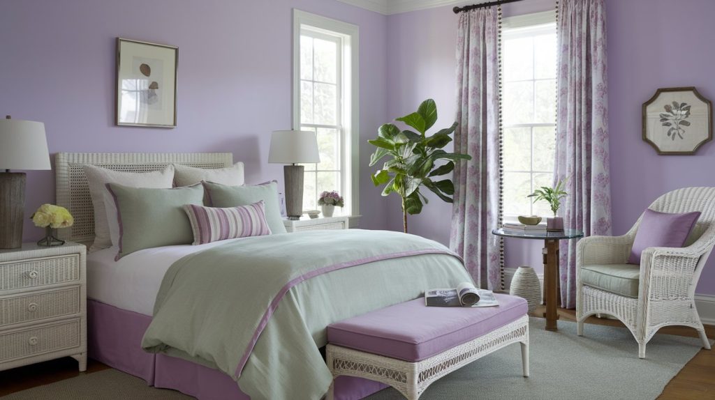
Back in the late ’90s and early 2000s, this color combo was everywhere especially in bedrooms and bathrooms. It was supposed to feel calming and stylish, but let’s be honest: it often leaned more sugary-sweet than serene. What was meant to feel spa-like sometimes felt like stepping into a candy shop. While it definitely had its moment, today’s trends favor more muted, modern, and grown-up tones leaving this once loved duo as a nostalgic nod to the past, rather than something we’re rushing to recreate.
This article was created with the assistance of AI but thoroughly edited by a human being.