A home’s exterior color sets the tone for its entire aesthetic, but some once-popular shades now feel outdated or unappealing. While they may have been trendy in their time, these colors can make a house look stuck in the past or clash with modern design trends. Choosing the wrong hue can also impact curb appeal and even resale value. If you want your home to feel fresh and timeless, it’s best to avoid these exterior colors that designers are moving away from.
1. Beige with Yellow Undertones
Once a go-to neutral, beige with strong yellow undertones can make a home look dated and dingy rather than warm and inviting. This shade often appears dull under natural light, emphasizing any imperfections on the exterior. Instead of offering timeless appeal, it can give homes a faded, tired look that lacks modern sophistication. Designers now prefer warm greiges or soft taupe that provide a more balanced and updated aesthetic without veering too yellow.
2. Earthy Oranges
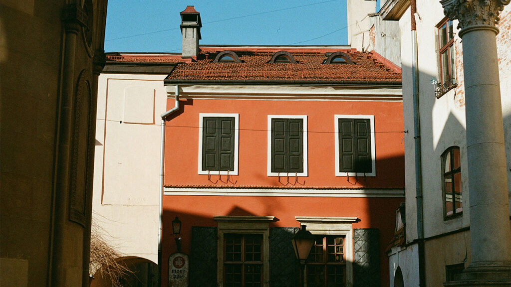
Deep, earthy oranges were once popular in Tuscan and Mediterranean-style homes, but today, they can feel overly heavy and outdated. This color tends to fade unevenly over time, often turning into an unflattering, sun-bleached shade. While rich hues can add warmth, this particular tone can overwhelm the exterior rather than enhance it. More subtle terracotta or muted clay tones offer a modern alternative that still provides warmth without overpowering the home’s facade.
3. Dark Brown
Deep brown exteriors were once seen as sophisticated, but they can now make homes feel dark, uninviting, and visually heavy. Instead of enhancing curb appeal, dark brown can absorb too much light, making a home appear smaller and dreary rather than warm and elegant. It also fades poorly, often turning an uneven, ashy tone over time. Lighter earth tones, rich charcoals, or deep navy hues create a more refined look without the weighty effect of dark brown.
4. Faded Pastels
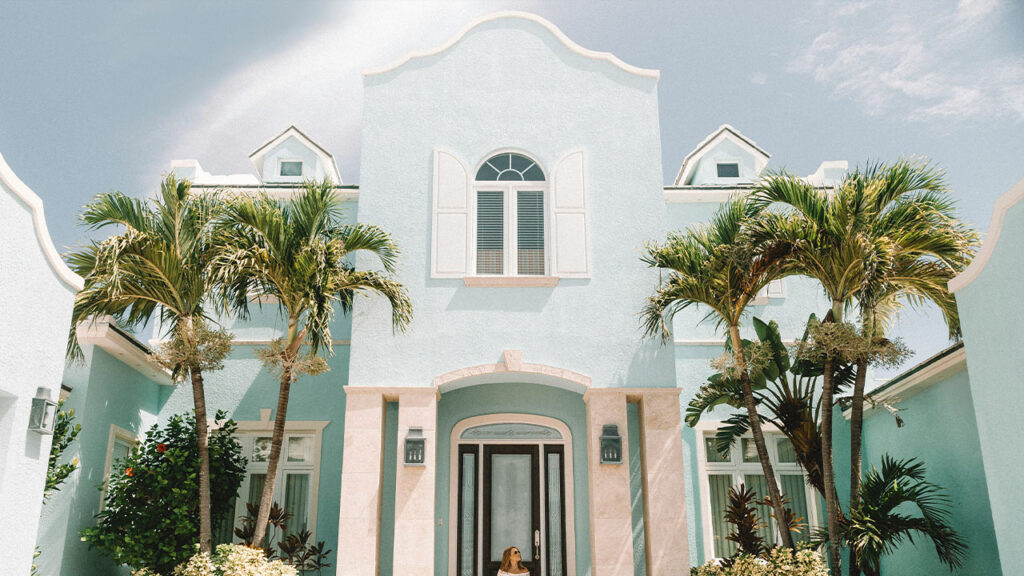
Soft pastel exteriors can initially seem charming, but over time, they often appear washed out and lack the bold definition needed for strong curb appeal. Light pinks, baby blues, and pale yellows can feel too whimsical and may not complement surrounding homes, making them look out of place. Additionally, these colors can show dirt and weathering more quickly. Instead, designers favor richer muted hues, like dusty blues or sage greens, that provide character without looking overly faded.
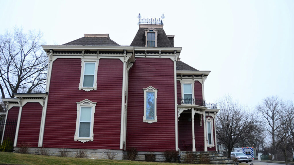
5. Bright Reds
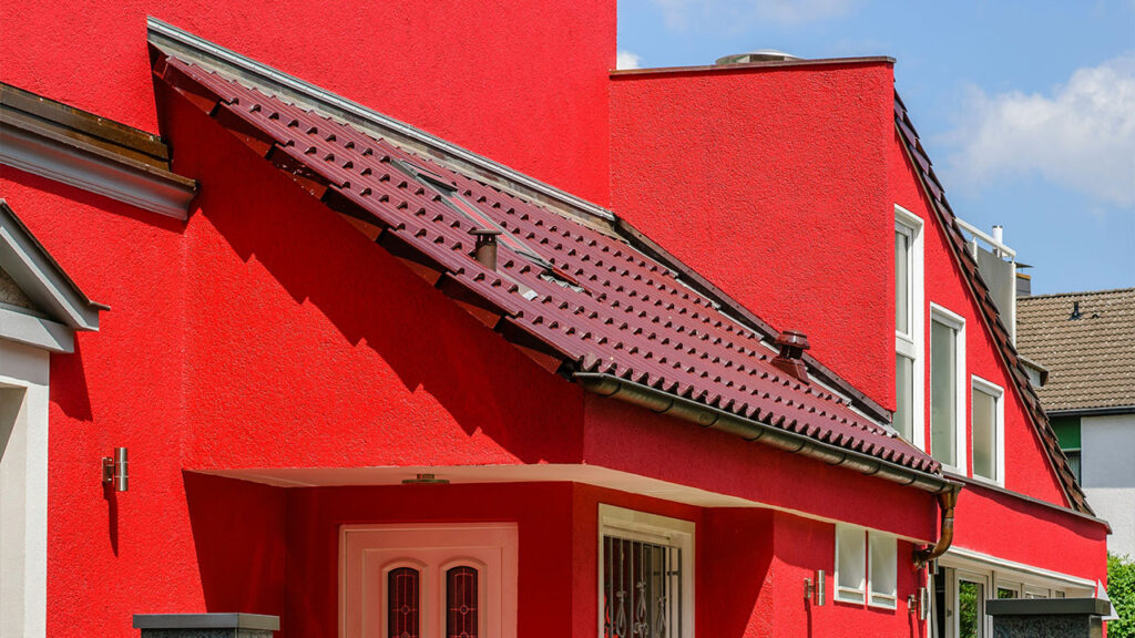
A bold red exterior can make a striking statement, but it often comes across as overwhelming rather than inviting. In large doses, bright red can clash with natural surroundings, overpower architectural details, and fade unevenly into an unflattering orange-pink hue. While red works well for accents like doors or shutters, it’s too intense for an entire home. Designers suggest opting for deep burgundy, brick-inspired reds, or warm clay tones for a more balanced and lasting appeal.
6. Cool Gray
Once a favorite for modern exteriors, cool gray has lost its appeal due to its stark, sterile look. Instead of feeling sleek and contemporary, it can make a home seem unwelcoming, especially in overcast or shaded environments where it takes on a cold, blue undertone. This shade also struggles to complement natural surroundings, clashing with greenery rather than enhancing it. Designers now lean toward warmer grays, soft greiges, or earthy neutrals that feel inviting and timeless.
7. Olive Green
Olive green had a moment in the ’90s and early 2000s, but today, it often feels outdated and dull. While green is making a comeback in modern homes, muted olive shades can appear murky and uninspired, especially when paired with traditional trim colors like beige or brown. This shade also struggles to maintain its vibrancy over time, often fading into an unappealing, muddy tone. Instead, designers recommend rich forest greens or fresh sage hues that provide a more current and elegant look.
8. Stark White
Bright white exteriors were once a hallmark of modern farmhouse and minimalist styles, but when too stark, they can feel flat and uninviting. Rather than exuding crisp sophistication, a pure white facade can wash out in direct sunlight, creating a harsh glare. Additionally, it highlights every imperfection and requires constant upkeep to keep it looking clean. Warmer whites, off-whites, or creamy shades offer a softer, more inviting alternative that still feels fresh without being too severe.
9. Purple-Toned Grays
Grays with purple undertones surged in popularity in the 2010s, but their overly cool and often unnatural appearance has fallen out of favor. These shades can be tricky, looking neutral in certain lighting but unexpectedly purple in others, making it difficult to match with landscaping or trim colors. As trends shift toward earthier, nature-inspired hues, these purplish grays can feel artificial and outdated. Instead, designers suggest opting for classic charcoals, warm taupes, or deep moody blues for a more enduring appeal.
10. Mustard Yellow
Mustard yellow can be a bold statement, but it’s a difficult color to get right on a home’s exterior. Instead of offering a cheerful, inviting look, it often feels overpowering and can clash with neighboring homes. It’s also a color that tends to age poorly, fading into an uneven, dull tone over time. While golden hues can add warmth, it’s best to choose softer, muted yellows or warm ochres that complement natural surroundings without overwhelming the facade.
This article was created with the assistance of AI but thoroughly edited by a human being.