Neutrals offer a clean and timeless foundation, but without contrast, they can sometimes feel bland. The secret to creating dynamic, balanced interiors is to introduce bold accent colors that inject personality and depth. Whether through textiles, furniture, or painted features, these striking hues can instantly energize a neutral room while maintaining elegance.
1. Emerald Green
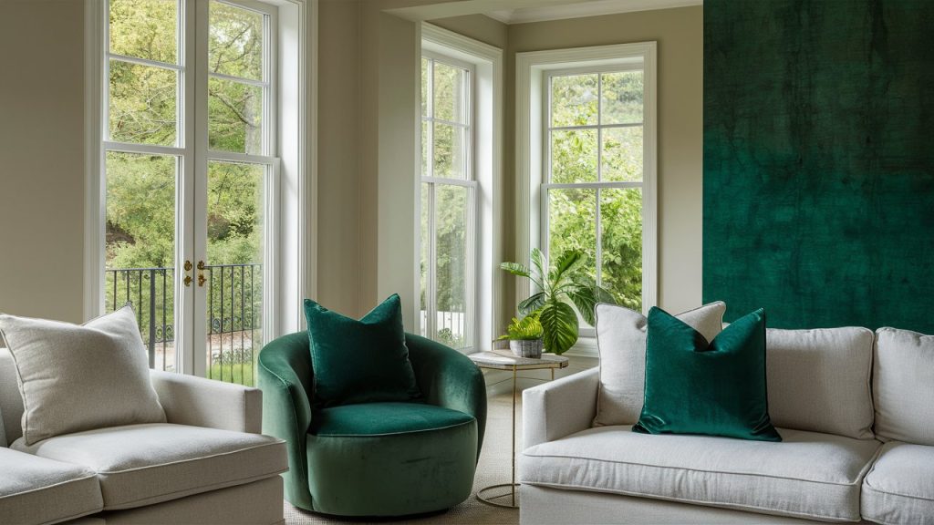
Emerald green adds a rich, organic sophistication to any neutral room. It pairs effortlessly with soft whites, beiges, and grays, offering a bold contrast that doesn’t feel overpowering.You can introduce it through accent chairs, plush velvet cushions, or even by creating a striking feature wall. Emerald’s lush undertone connects the indoors with nature and evokes a feeling of balance and serenity. It’s especially effective in living rooms or bedrooms where you want a cozy yet refined look.
2. Navy Blue
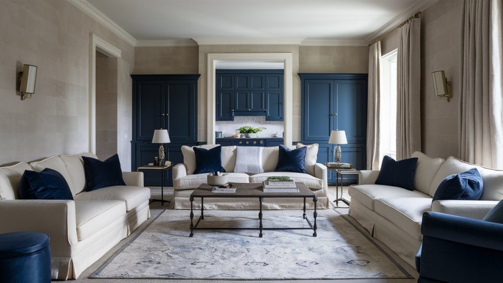
Navy blue is a timeless accent that adds structure and elegance to neutral palettes. It works beautifully against cream, taupe, and light gray walls, creating a grounded, classic contrast. Use navy in large area rugs, upholstery, or cabinetry for a bold but sophisticated pop of color. It’s ideal for traditional or transitional spaces, giving the room a sense of confidence and calm. For added depth, layer it with mixed textures like linen or leather.
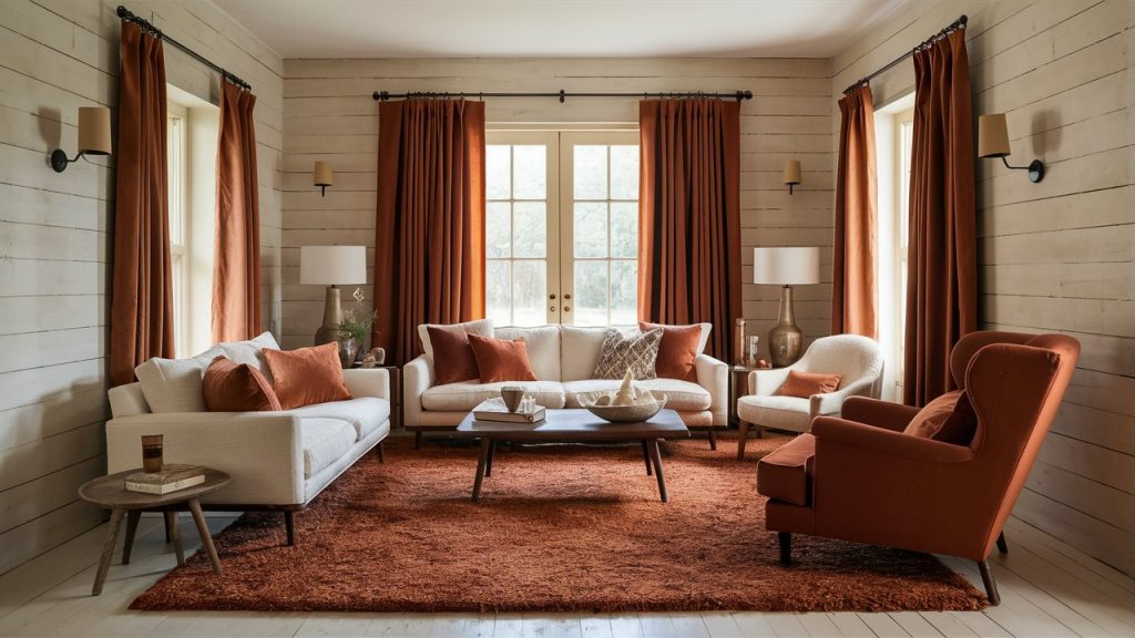
3. Terracotta
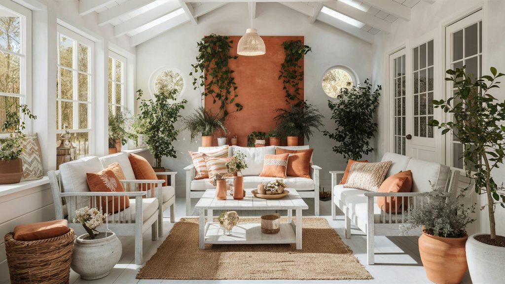
Terracotta infuses a sense of warmth and rustic appeal into neutral spaces. Its rich orange hues provide depth and character, complementing cool grays or bright whites to create a cozy and inviting atmosphere. This accent works well in ceramics, planters, throw pillows, or even tile work. Terracotta feels grounded and natural, making it perfect for boho, Mediterranean, or desert-inspired styles. It adds a sense of timeless comfort while maintaining visual interest.
4. Mustard Yellow
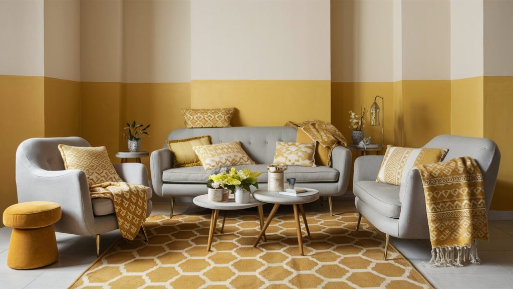
It adds a sense of timeless comfort while maintaining visual interest. Its muted tone makes it versatile enough to work with a range of neutrals—from beige to charcoal gray—without appearing too bright or brash. Add it through throw blankets, cushions, or a patterned rug for a fun and stylish accent. Mustard adds just enough color to liven up the space while still feeling grown-up and curated. It’s especially effective in living areas, dining spaces, or creative workspaces.
5. Black
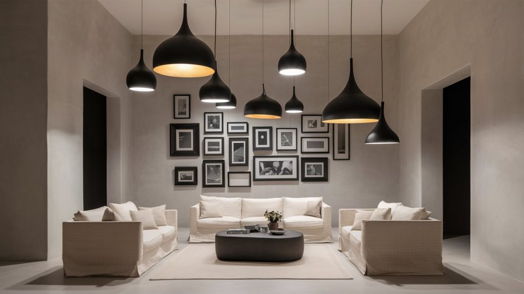
Used thoughtfully, black becomes a powerful accent in neutral rooms. It adds depth, contrast, and a modern edge. A matte black pendant, picture frame gallery, or sculptural decor item draws the eye and makes lighter shades feel more dynamic. Black accents create a graphic pop that sharpens the entire design, especially in minimalist or contemporary interiors. It helps define architectural elements and adds an effortlessly chic vibe.
6. Crimson Red
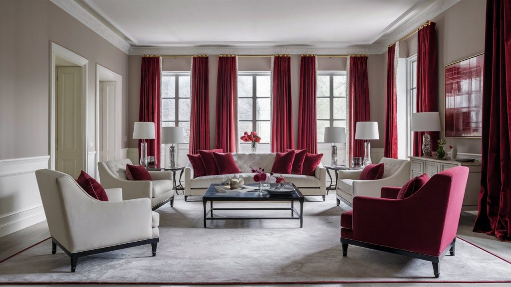
Crimson red brings bold sophistication and passion to a neutral space. Its deep, saturated hue contrasts beautifully with soft grays, taupes, and creamy whites, creating a rich, elegant atmosphere. Use crimson in velvet drapes, accent walls, or a striking armchair for maximum impact. This color is ideal for formal living rooms or dining spaces where you want to add drama and warmth. It’s a confident shade that energizes a room without overpowering the overall design.
7. Teal
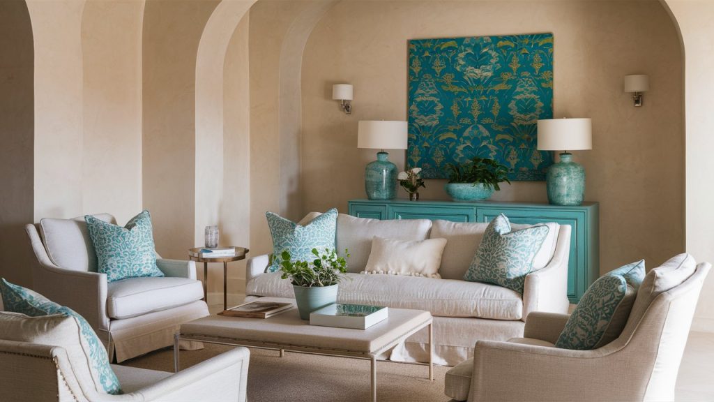
Teal brings vibrancy and a fresh, coastal vibe to neutral interiors. This blend of blue and green contrasts nicely with beige, cream, or warm grays, making the space feel energized but still cohesive. Introduce teal into your space with patterned pillows, eye-catching artwork, or a beautifully painted sideboard. It’s a flexible shade—calming in natural light, cozy in evening light—making it a smart choice for living rooms, kitchens, or sunrooms that need a lively yet relaxed accent.
8. Burnt Orange
Burnt orange delivers bold warmth without the intensity of a bright red. It enhances neutral backdrops by creating visual interest and seasonal richness, especially when layered with cream, sand, or deep brown. Bring teal into your room with a stunning area rug, elegant curtains, or a statement chair. This color shines in rustic, eclectic, or mid-century modern spaces, making rooms feel lively yet grounded. Its earthy tone adds depth and works beautifully year-round, especially in fall and winter.
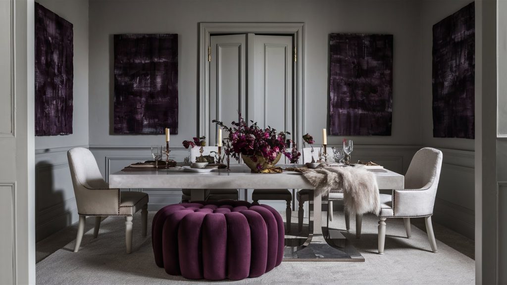
9. Moody Aubergine
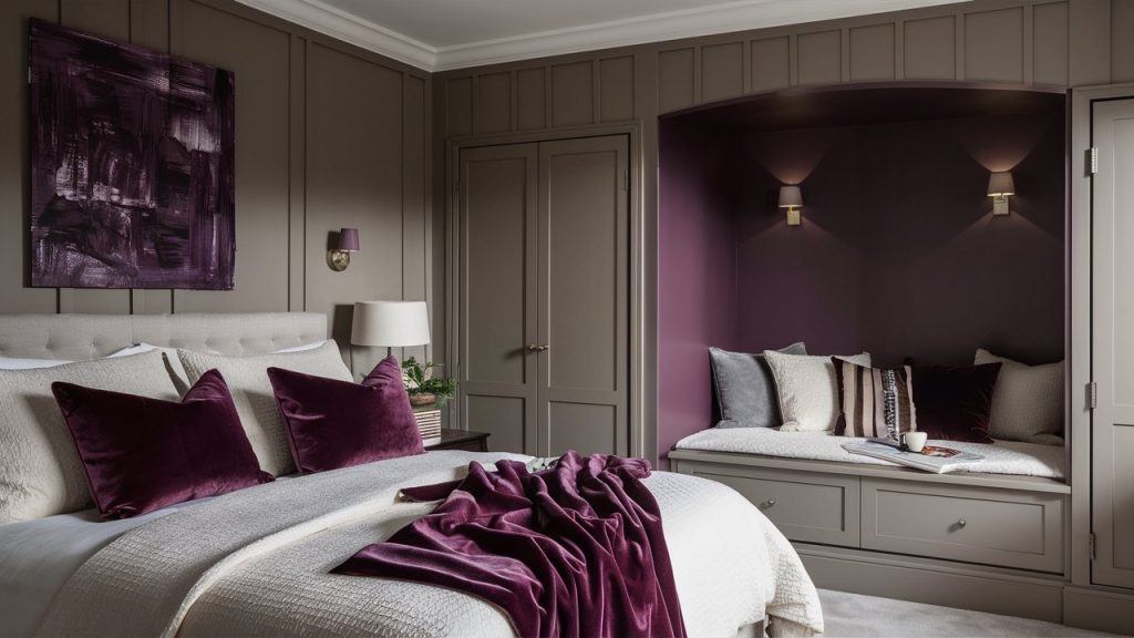
Moody aubergine—an elegant deep purple with warm undertones—brings richness and drama to neutral interiors. Use it for velvet throw pillows, abstract art, or even a painted alcove to create depth. It complements taupe, ivory, and charcoal effortlessly, adding a touch of sophistication while maintaining a balanced, understated elegance. Aubergine feels both cozy and upscale, making it ideal for intimate spaces like bedrooms, dens, or reading nooks.
10. Coral Charm
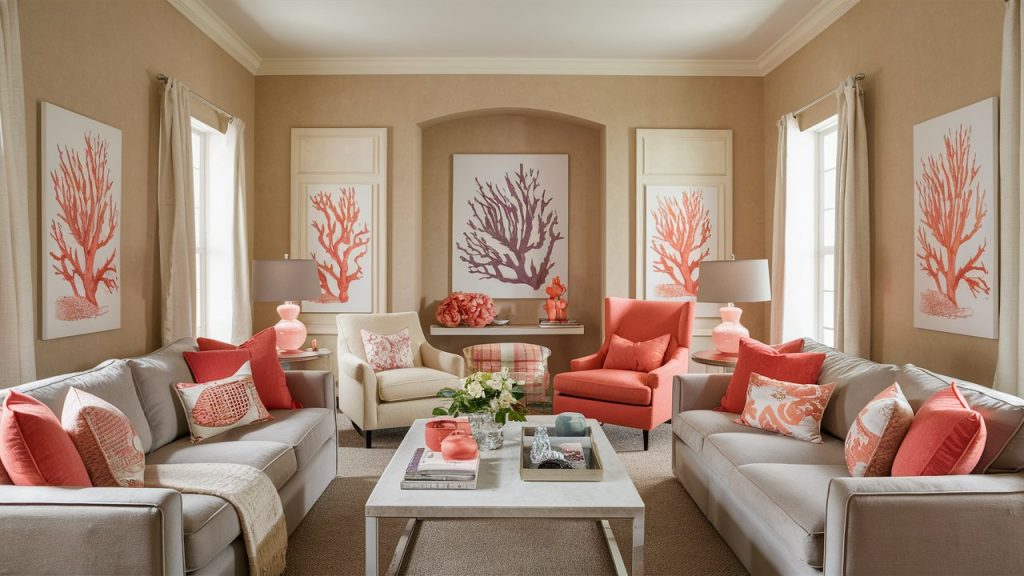
Coral adds a cheerful burst of energy to neutral rooms without feeling too loud. Its blend of pink and orange tones works beautifully with beige, ivory, or warm gray, instantly uplifting the space. Try coral in artwork, throw pillows, or a bold accent chair to create a vibrant focal point. It’s especially effective in living rooms, nurseries, or kitchens, where a playful yet polished feel is welcome.Coral infuses warmth and character, transforming any neutral palette into a vibrant, lively space full of energy and charm.
This article was created with the assistance of AI but thoroughly edited by a human being.